

— Introduction —
Background
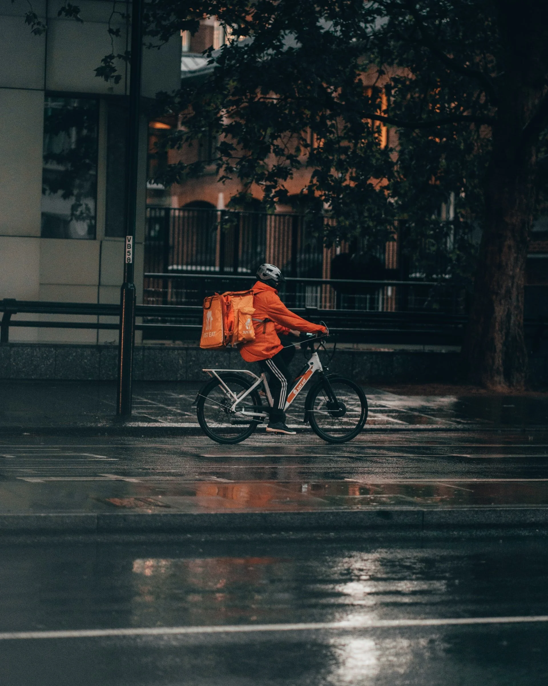
DoorDash drivers are called Dashers. Dashers are independent contractors who use the DoorDash Driver App to earn money by picking up and dropping off deliveries. Dashers make their money based on the number of deliveries they complete, the total price of the orders they accept, and tips.
The purpose of this study is to understand the major pain points Dasher’s experience when using the DoorDash Driving App and how these contribute to issues such as canceled orders, delivery lengths, earning potential, and Dasher frustration.
Challenge/ Task
Add new feature(s) to DoorDash Delivery App, Dasher.
Role
Role: UX Researcher, Visual Designer, UI Designer
Team: Solo, with mentorship
— Research —
Research Goals
Understand how a user uses the app when driving.
Determine what pain points users have with the app.
Determine what a user needs for efficient deliveries.
Determine what users enjoy about the app.
Research Questions
What is an average delivery like for users?
What actions do users take while delivering?
What app features do users use while delivering?
What frustrations do users experience with the app?
How do user frustrations affect their deliveries?
How do users deal with app frustrations?
Competitor Analysis
Online food ordering and delivery platform.
Companies:
Surging Prices
Different Modes of Transportation
Pay for Pick-Up, Drop-Off, Waiting & Milage.
Variety of Deliverables
Flexible Hours
Entrepreneur
Potentially Low Earnings
I chose UberEats, Postmates, and Grubhub to be direct competitors because they are major competitors of DoorDash. I also wanted to see why, depending on where you live, you are more likely to see one company over another. For the other competitors, I chose Instacart and Amazon because they are large delivery services and I wanted to see what they do differently compared to food delivery services.

Research Participants
I made an online questionnaire and posted it on multiple social media outlets. I used a lot of thought-provoking questions as opposed to yes or no questions. I made lots of the questions short answer responses so participants can tell their stories. I thought of questions that gave me a better idea of their deliveries and how they would use the app. I also tried to think of questions about the features I've thought about adding in hope that these questions gave me an understanding of users' thoughts.
Interview Participants:
21+ years
Current delivery drivers
DoorDash Delivery Drivers
Competitor Delivery Drivers (UberEats, GrubHub, etc.)
Interview Questions
How long have you been a delivery driver?
How many days and hours do you drive a week?
What times do you drive? Do you deal with traffic?
Can you describe a time when you had an issue or issues with the delivery app?
What happened?
Did the issue affect your deliveries? If so, how?
Are you picky with the deliveries you accept? Why?/Why not?
Research Findings
It took much longer than I anticipated before I got any feedback. I originally posted my survey on slack and facebook but after getting 4 participants I posted my survey on Reddit I got 6 more people to participate. Looking back, I wish I skipped the survey and just did one-on-one interviews. It would have been faster.
Since I conducted a survey, getting all the participant information together didn't take too long. I used Google Forms and there is a summary section available. I went over each question summary and grouped the participant into sections. What I learned is that there were more pains than gains and most of the frustrations with the app come from crashes or glitches.
Gains:
The participants all mentioned they enjoy the flexibility and extra cash that comes with driving for an online delivery service.
7 of 8 participants select orders with short distances and higher pay.
6 of 8 participants mentioned delivery rewards/promotions through their app.
Pains:
The participants all expressed frustration with having to wait at restaurants to pick up their deliveries.
5 of 8 participants have experienced their delivery app crashing and terminating orders.
2 of 8 participants mentioned not taking long distanced orders because they do not want to leave their delivery zone.
8 of 8 participants stated they are unaware they will have to wait until they arrive at their pickup destinations.
1 of 8 participants is only able to utilize one delivery app at a time because of their phone capabilities.
Similarities:
All the participants drive during high traffic times and message customers when there is an issue.
7 of 8 participants drive for one delivery service at a time.
7 of 8 participants drive for DoorDash.
2 of the 8 participants drive for UberEats.
4 of 8 participants have used a different delivery app than the one they currently use.
4 of 8 participants drive less than 10 hours a week.
4 of 8 participants have stopped using a driving app.
Surprises:
The majority of the participants are over 30 and drive for less than 10 hours a week.
6 of 8 participants are over 30 years old.
3 of 8 participants have had no issues at all.
2 of 8 participants drive for more than one delivery service.
1 of 8 participants is not selective about accepting orders.
2 of 8 participants don’t use apps that offer ways for them to make more money or be rewarded.

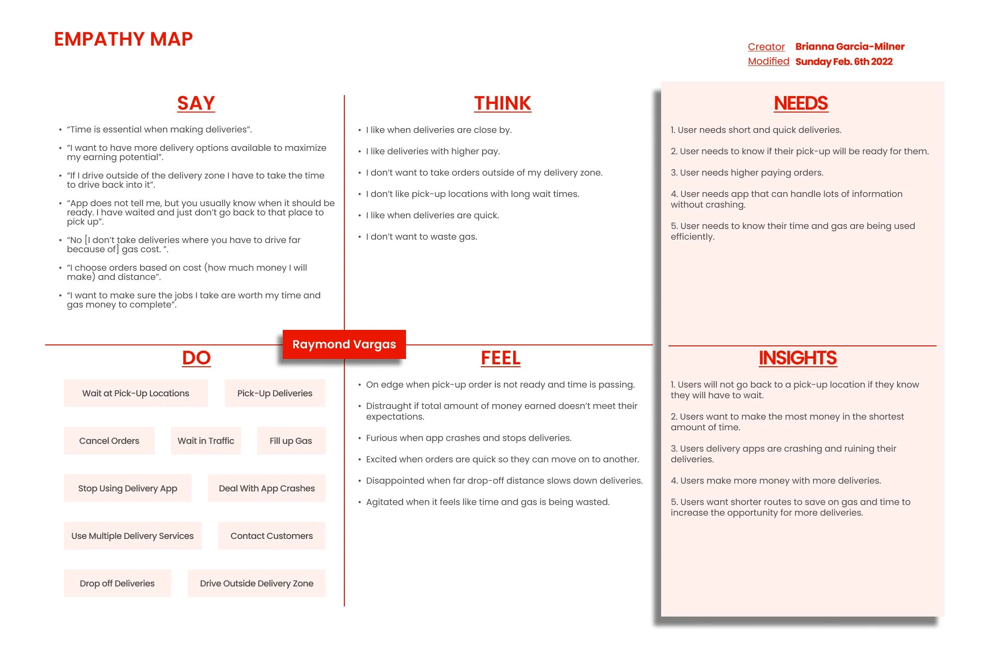
Empathy Map
I used my interview results and findings to create my empathy map. My first empathy map was too general and focused too much on the developmental aspect of the app. For my second empathy map I focused on specific topics related to the drivers vehicles like gas and time.
Needs
Short and quick deliveries.
To know if their pick-up will be ready for them.
Higher paying orders.
An app that can handle lots of information without crashing.
To know their time and gas are being used efficiently.
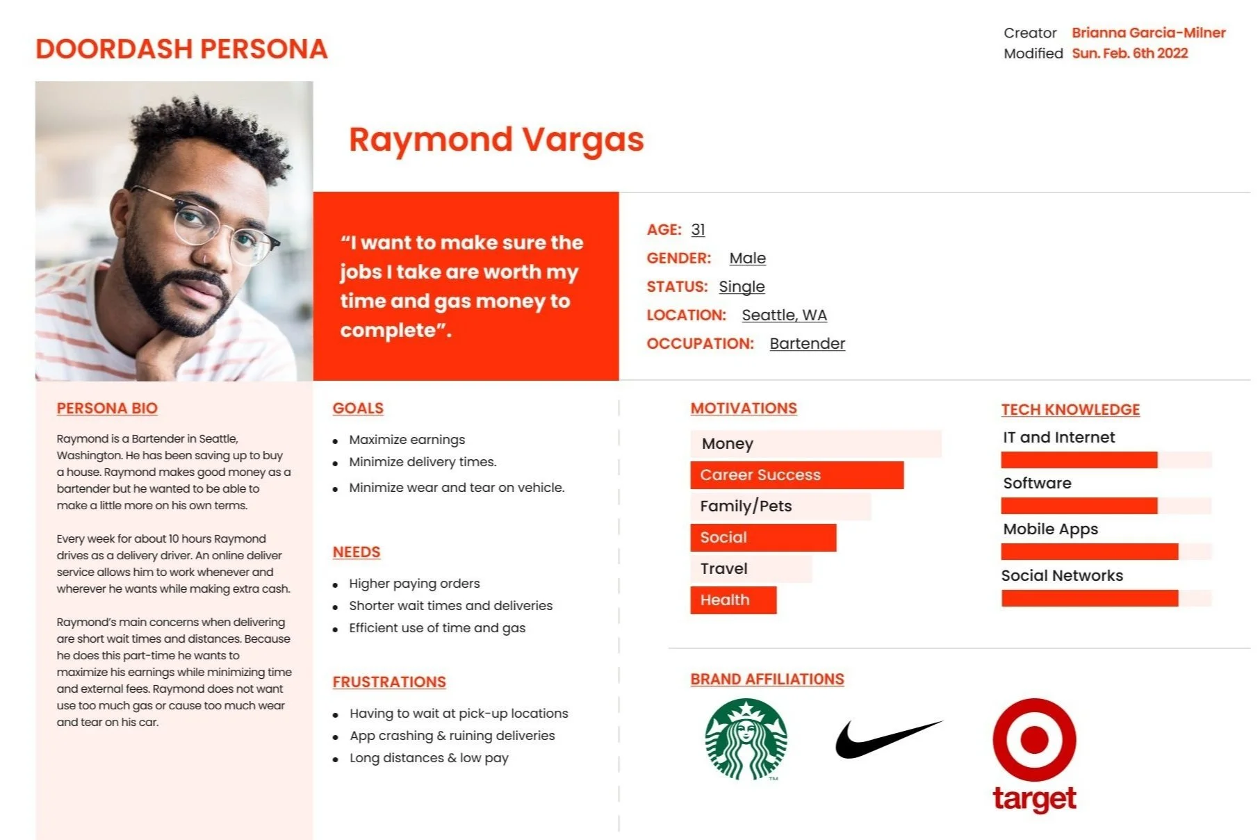
Persona
I used the needs and insights from my empathy map to create my persona. I used a direct quote from one of my interviews, the demographics of my participants and started building around those.
Raymond Vargas
Needs higher-paying orders with shorter wait times and deliveries and wants to use his time and gas efficiently.
— Define —
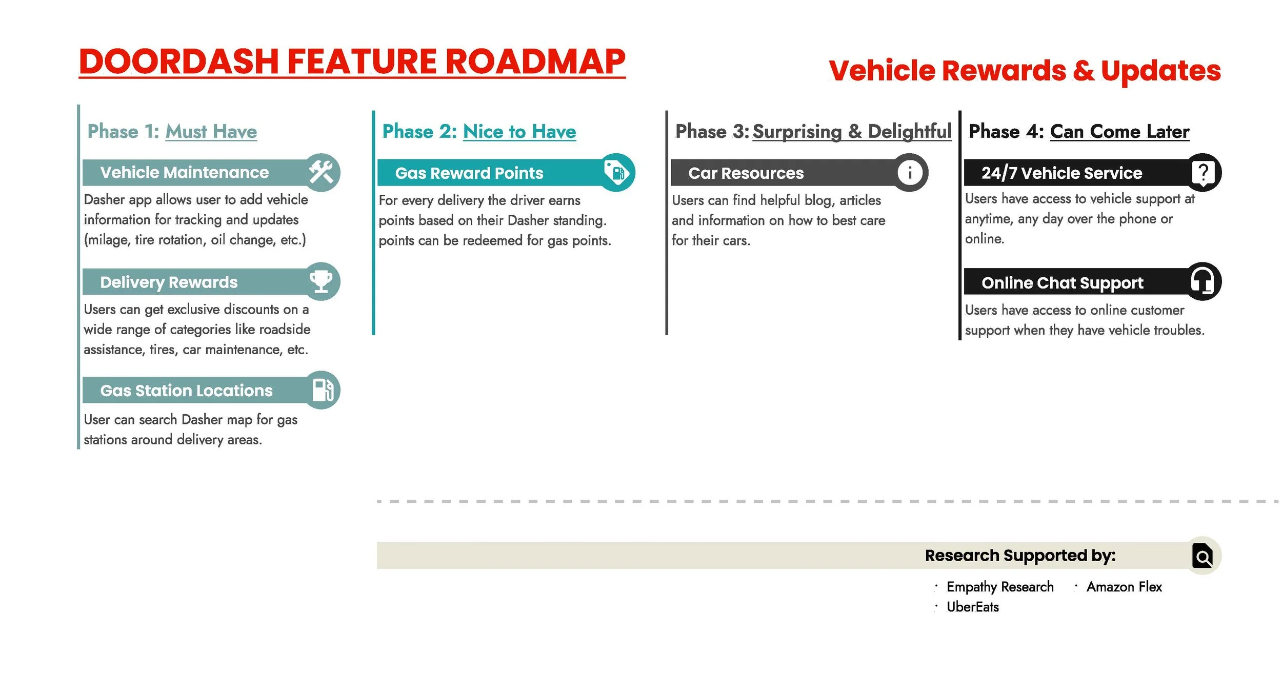
Feature Roadmap
I looked at DoorDash’s competitors to see what rewards and features they offered then wrote them down.
My original feature ideas didn’t work with the results I got from my empathy research so I came up with new ones to fit the users needs. After some brainstorming the new features revolved around the users vehicles. I based most of my features on 2 main competitors, UberEats & Amazon Flex.
— Design —
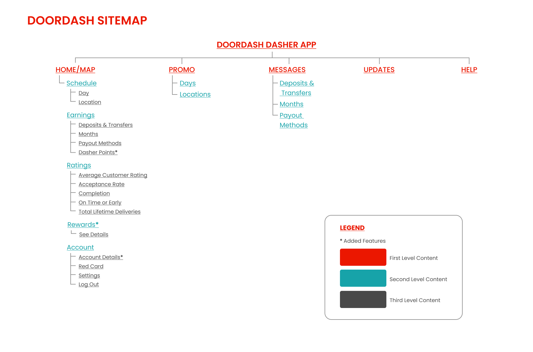
Site Map
I used my empathy research and competitive research to help me create my site map. I downloaded the Dasher app to be able to walk through the screens and decipher their site map. With their site map, I determined where my new features and pages could go. I labeled the added features on the map with asterisks.
Task Flow
I used my interviews and competitor analysis to create my task flow. I also went to DoorDash's website once again for more information. On DoorDash's website, they have a step-by-step delivery video. I asked a delivery driver to double-check the process and I learned that DoorDash's video is outdated and has changed since the app was recently updated.

User Flow
I used my task flow and DoorDash's website to create my user flow. I started by writing down every step and connection. It's easier for me to change things when it's on paper than on the computer. After I've created my flow, I like to go through it and see if it makes sense or if I've missed anything.

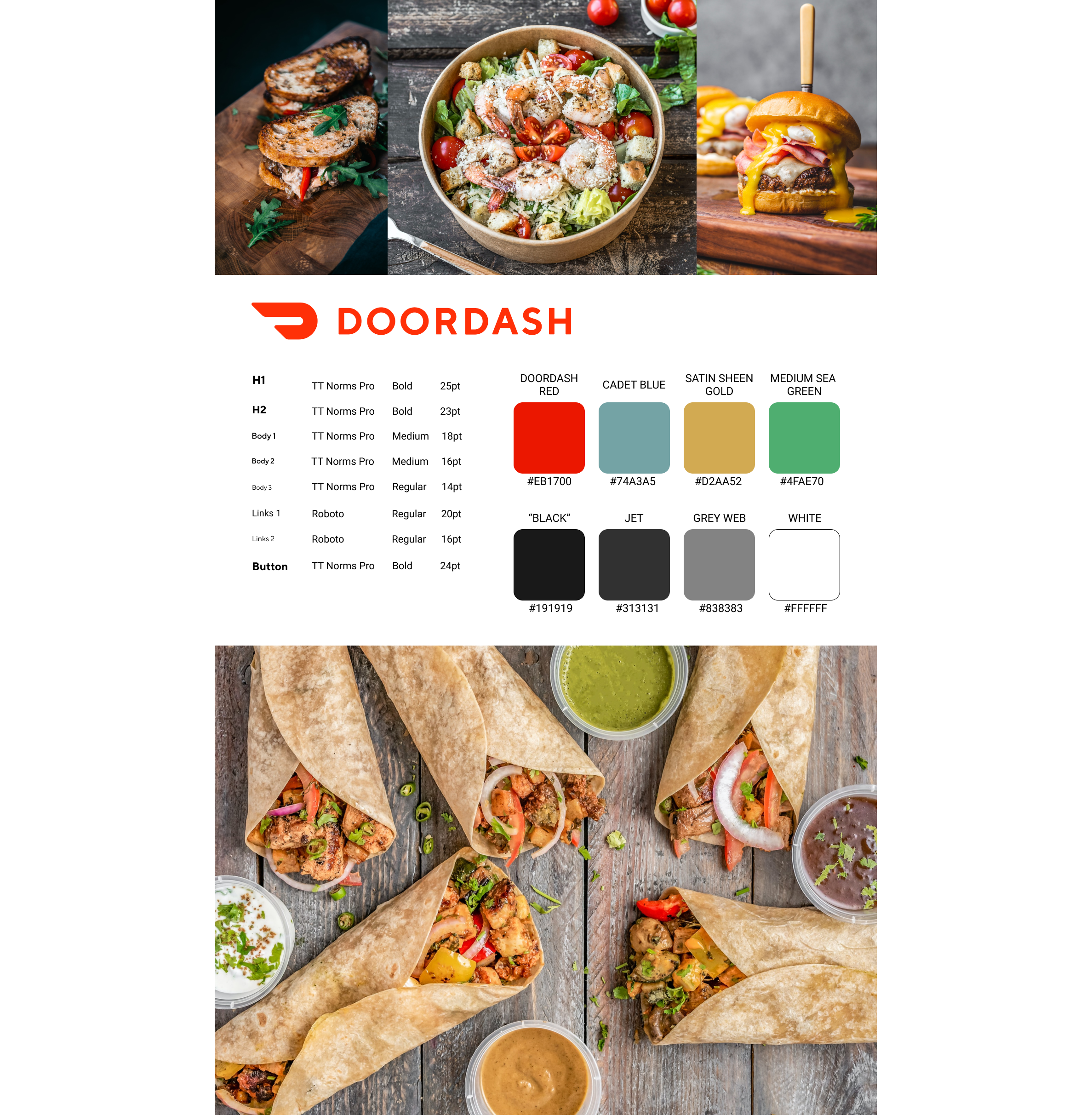
Style Tile
I didn’t create a mood board for this style tile because Doordash already has an identity, but I did kind of use their website as a quasi-mood board for this style tile.
And because I am adding features to an already existing app, I collected DoorDash’s color scheme, logo, and fonts. I used the Dasher app to get the color palettes and fonts. I looked for DoorDash's branding information on their site but couldn't find it. I did find an article about the images Doordash uses, so I used that as a reference when searching for images.
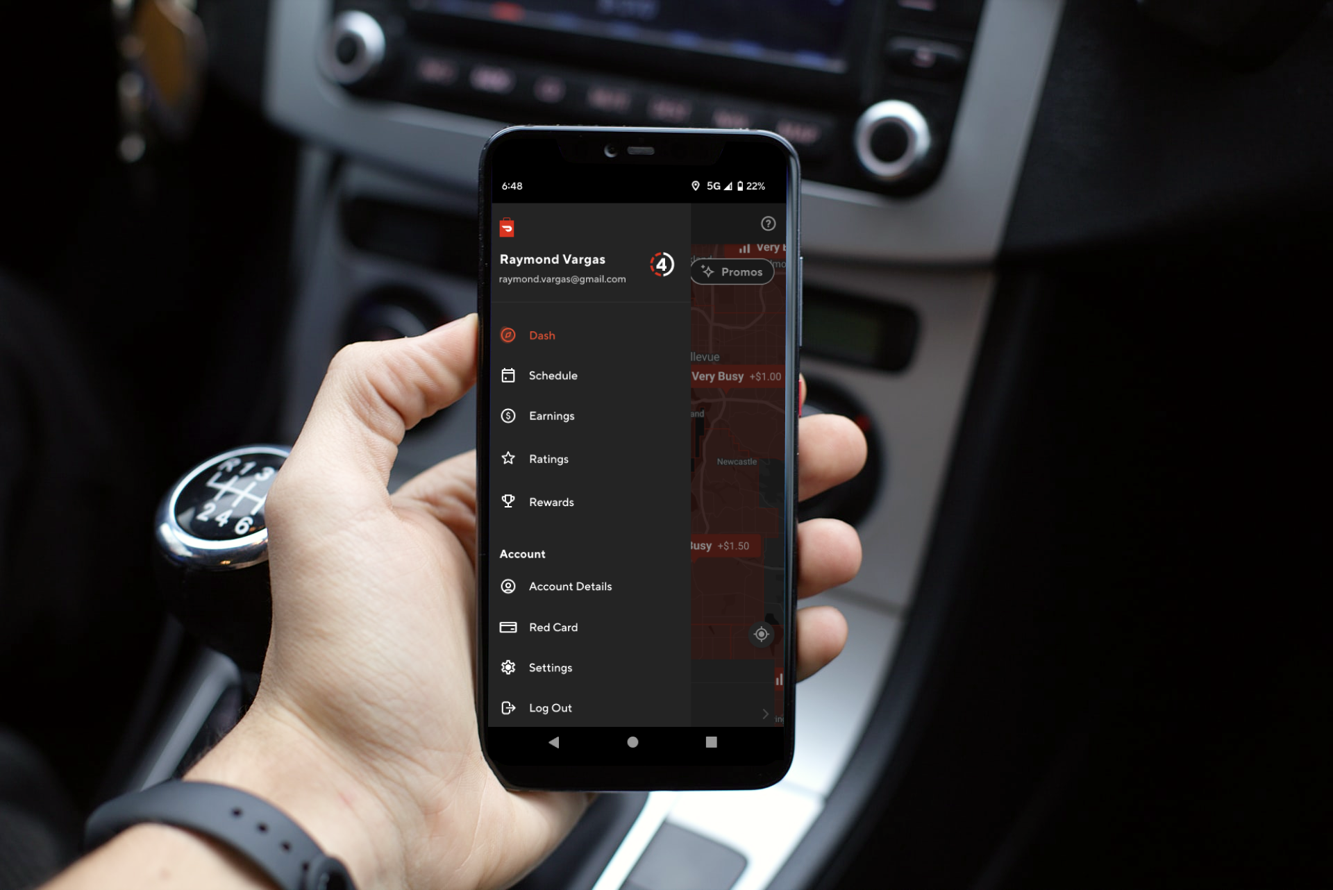
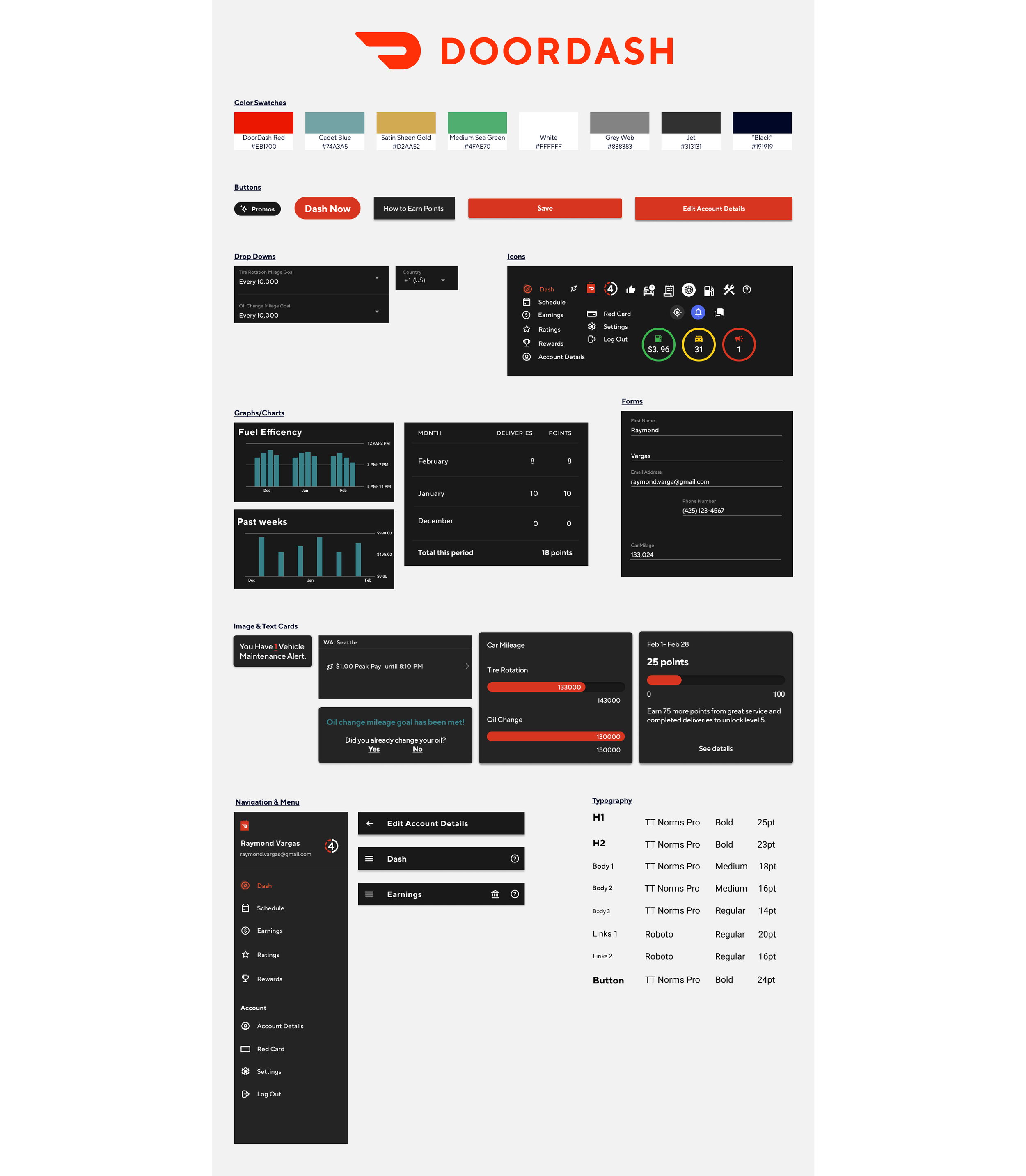
Wireframes
I skipped over low-fi wireframes and went straight to hi-fi wireframes.
I wanted to add my features as seamlessly as possible; I used screenshots from DoorDash and competitors as references. I used the UberEats delivery app and the Amazon Flex app.
It was much easier for me to add my features when I could actually see how they would look and work with the current DoorDash screens. Most of the features I added integrated into DoorDash’s current screens but I did end up making 2 new pages, “Dasher Points” and “Rewards”.
Rewards
Earnings
Dasher Points
Pages
Home
Menu
Account Details
Edit Account Details
-
![]()
Home Page
-
![]()
Menu Page
-
![]()
Account Details
-
![]()
Edit Account Details
-
![]()
Rewards
-
![]()
Earnings
-
![]()
Dasher Points


UI Kit
I like to create my UI kit after my wireframes because it’s easier to grab everything. I took all the buttons, input boxes, icons, features, etc., and copied and pasted them all into a Figma file. Then I organized them all into my UI Kit template.
There were a lot of items to copy and paste so I was very meticulous and made sure that I didn't miss anything.
— Test —
Prototyping
After I wrote down my testing goals I was able to generate ideas. I then connected my pages together. The tasks were pretty simple so the prototype was as well.

Usability Test
I had 4 participants test my prototype. They have been/currently are delivery drivers for online delivery service(s). They were asked to complete 3 tasks, as they did that I wrote down their actions and responses.
Participants were asked to perform 3 Tasks:
Find Vehicle Information and Alerts.
View Dasher Rewards
Find Monthly Reward Points Earned
For my Usability Test findings, I took my test results and divided them into goals, completion rate, error rate, notable findings, and recommendations/comments.
Participants completed all the tasks asked of them. One recurring issue amongst a few participants was listening and understanding the tasks. Overall, the tasks were pretty simple and only one participant really struggled.
Test Completion Rate:
4 of 4 participants were able to complete all the tasks
2 of 4 participants completed 3 tasks with no issues.
3 of 4 participants had issues when tasked with updating vehicle information- “oil change”.
1 of 4 participants had some trouble with 2 of the 3 tasks.
Error-free Rate:
1 of 3 tasks was completed with no errors (100% error-free)
2 of 3 tasks were completed with 2 of 4 participants having issues (33.3% error-free)
Notable Findings:
3 of 4 participants scrolled past the “oil change” one or more times.
2 of 4 participants didn’t listen to/understand one or more of the tasks and continued navigating the app after the task(s) were completed.
3 of 4 participants tried to select the “how to earn points” button to find information regarding rewards.
Recommendations/ Comments:
3 of 4 participants commented that the app was simple and easy to navigate.
1 of 4 participants commented that it would be easier to see the alert icon next to “oil change” if it was a different color.
1 of 4 participants commented that they wanted to be able to click the “oil change” text to update their information.
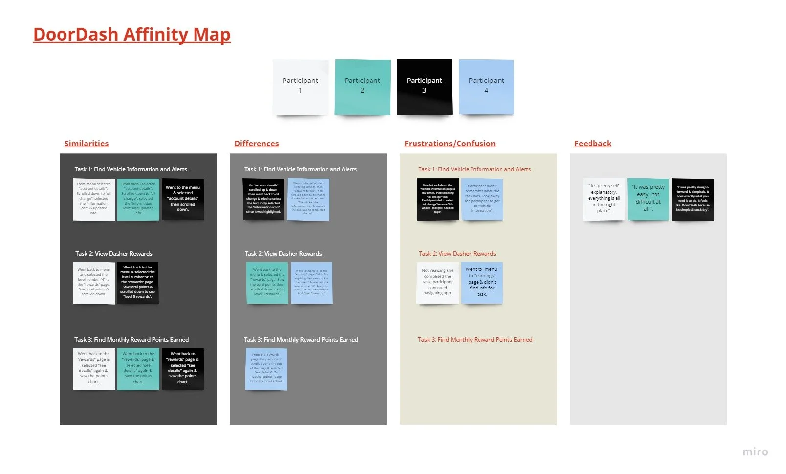
Affinity Map
To create my map I took my usability test findings and categorized them into similarities, differences, frustrations/confusion, and feedback.
Similarities:
3 of 4 participants went to the menu and selected “account details”. Then scrolled down to “oil change”, selected the “information icon” & updated their info.
2 of 4 participants went back to the menu and selected the level number “4” on the “rewards” page. Saw the total points & scrolled down.
3 of 4 participants went back to the “rewards” page & selected “see details” again & saw the points chart.
Differences:
1 of 4 participants went to the menu, tried selecting settings, then "account details". Then scrolled down to oil change & asked what the task was. Then clicked the information icon & opened the pop-up and completed the task.
1 of 4 participants went back to the menu & selected the “rewards” page. Saw the total points then scrolled down to see level 5 rewards.
1 of 4 participants went to the “menu” & to the “earnings” page. Didn't find anything then went back to the “menu” & selected the level number “4”. Saw the point total then scrolled down to find "level 5 rewards".
1 of 4 participants went from the “rewards” page, the participant scrolled up to the top of the page & selected “see details”. On “Dasher points” page found the points chart.
Frustrations/Confusions:
1 of 4 participants scrolled up & down the “vehicle information page a few times. Tried selecting "oil change" text. Participant tried to select ‘oil change’ because "it's where I thought I needed to go’.
1 of 4 participants didn't remember what the task was. Took a while for the participant to get to "vehicle information".
1 of 4 participants continued navigating the app not realizing she completed the task.
1 of 4 participants went to the “menu” to the “earnings” page & didn't find info for the task.
Feedback:
“ It’s pretty self-explanatory, everything is all in the right place”.
"It was pretty easy, not difficult at all”.
"It was pretty straightforward & simplistic. It does exactly what you need it to do. It feels like DoorDash because it’s simple & cut & dry”.
Next Steps
After testing, I found that there were no changes that needed to be made to the prototype. However, based on the issues the participants did I have, there are some changes I need to make for future projects. I need to work on my usability testing introduction and make the task finish lines really clear. Allowing participants to first explore the prototype before asking them to complete tasks might help them feel more comfortable. Rewording and simplifying my tasks will also give participants a better understanding of what they need to do.
— Conclusion —
All in All
The beginning of this project was where I struggled the most. I spend time waiting for participants to complete my research survey and I struggled with thinking of out-of-the-box ideas for my added features. However, despite the struggles, I enjoyed this project immensely.
Like every project I have completed, I learned a lot. One major bump in the road for me was my empathy research surveys. Not only did I have to wait for participants, but the information I gathered would have been the same if I just interviewed participants. The lack of control and details from the survey results really hindered my process. The struggle with the survey helped me learn when a survey should be utilized and when it shouldn’t.
The other hurdle I had with this project was coming up with new feature ideas based on my persona and empathy map. My first empathy map iteration didn’t give me exclusive and specific needs to come up with a solution to user problems.
Even with the struggles, my favorite part of this project was coming up with feature ideas. My first set of ideas were kind of generic and simple. After brainstorming, the solutions I found were much more fun and creative ways to solve user problems.
Sound Like Your Cup of Tea?
If I sound like a great addition to your team, or if you just like what you’ve seen here and want to say hi, reach out!
All positive vibes are welcome!!
You May Also Like
-
![]()
The Happy Hen
-
![]()
Kaus Insurance
-
![]()
Pet Adventure


