


— Introduction —
Background
Established in August of 2010, Pet Adventure is a locally owned and operated pet food and supply store in Mountlake Terrace, Washington. They have a huge selection of the finest dry, canned, raw, freeze-dried, premium, holistic and natural diets for dogs and cats. They also stock hundreds of food, treats, toys, and all the pet supplies you could ever need.
The purpose of this study is to understand what pain points users have when shopping for their pets and how these experiences affect the user and their pets.
Challenge
Sell pet products to customers online.
Tasks
Design a new modern logo.
Design an e-commerce website
Role
Role: UX Researcher, Visual Designer, UI Designer
Team: Solo, with mentorship
— Research —
Research Goal
Create a responsive site making it easy and convenient to find solutions for pets’ and owners’ needs by:
Understanding what issues users have experienced with competitors.
Determining what problems and solutions are important to users.
Determining how users are currently solving pets’ needs.
Research Questions
What features/products make users choose a pet store?
Do users have a favorite/preferred pet store? Why?
Do users shop at the same company but prefer specific stores? Why?
Why do users choose one company over another?
Have users ever changed from shopping at one company to another? Why?
Are users purchasing pet products in-store, online, or a combination? Why?
What products do users currently purchase? Why?
How often are users purchasing pet products?
Competitor Analysis
Pet stores were created to improve the lives of pets and parents with quality products and services.
Limited locations
Specialty orders
Companies
Pick-up & delivery options
Rewards programs
Wide selection of products & brands
For the competitors, I chose Petco, Petsmart, Mudbay, Bothell Pet Feed & Supply, and Portage Bay Grange.
I chose 3 large corporations to help me determine what strengths and weaknesses they have as major corporations. I chose 2 small local competitors to help me find their strengths and weaknesses as smaller companies. I wanted to see how they handle customers and how that might help Pet Adventure as a small company.

Research Participants
Participants were asked about their pets, what products they typically purchase, how often, and why. The participants were also asked about what they like and dislike about where they currently shop for their pets.
Five individuals participated in remote and in-person interviews.
Ages: 18-60
Employed
People who have pets
People who shop for their pets online
People who shop for their pets at local businesses
People who shop for their pets at large commercial businesses
Interview Questions
What do you typically do with your pet? (walks, play, trips, etc.)
Does your pet have any specific needs? (special diet, medication, etc.?)
Do you have a favorite/preferred pet store? Why?
What do you like about this company?
What do you dislike?
What products do you purchase regularly?
What do you like about these specific products?
Research Findings
All participants are current pet owners who shop for pet products. The participants all seemed to have similar requirements when it comes to looking for a store to purchase pet products. They also had similar reasons for changing and disliking stores.
Gains:
Participants all mentioned the desire for stores with more selections and more affordable pet products.
4 of 4 participants discussed purchasing products to meet their pet’s needs.
4 of 4 participants focused on price over brands.
2 of 4 participants want to shop for their pet products at the same time they are shopping for their own products.
4 of 4 participants want stores close to their homes.
3 of 4 participants want stores that offer the option to order their products online.
Pains:
Participants expressed frustration with the lack of control selection and help.
3 of 4 participants discussed frustration at waiting to receive their purchases.
4 of 4 participants mentioned affordability when discussing their purchases.
2 of 4 participants expressed frustration with not having a staff member available to help with purchases.
Similarities:
All the participants found information for insurance online.
4 of 4 participants seemed to only purchase the necessary pet products and rarely spoiled their pet by purchasing an unnecessary product.
4 of 4 participants have one or more pets.
4 of 4 participants have pets with specific dietary needs.
Surprises:
When choosing their preferred stores to purchase pet products, participants all mentioned stores that are not pet-focused.
4 of 4 participants mentioned their desire for a greater selection but they also all stated that they usually purchase the exact same products each time. And they only purchase different products if necessary.
2 of 4 participants mentioned reading customer reviews.
1 of 5 participants mentioned purchasing

Empathy Map
Creating the empathy map took me less time than I thought it would. It was pretty easy to use my interview answers and findings to create my map and get my insights and needs.
Needs
Variety
More specialty options.
Affordability
Online Availability

Persona
I used my empathy map to create my persona. I used a user generator tool to get the name and image for my persona. I took a quote from my interviews and made a story around that. The brands I chose reflect her outdoor lifestyle and her dogs.
Eileen Terry
Needs a large variety of specialty dog food options with an affordable price tag that she can purchase online or in-store.

— Define —
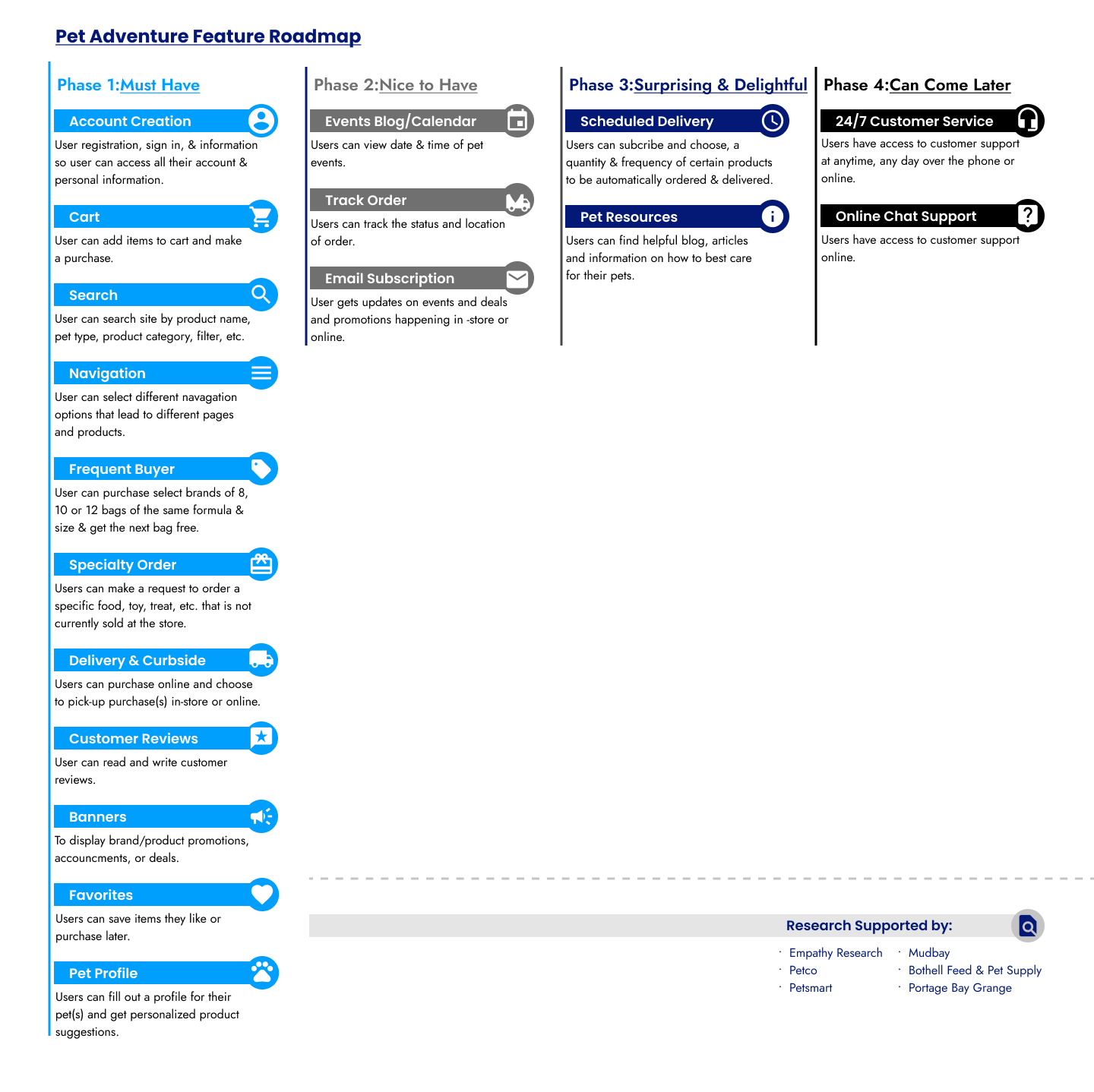
Feature Roadmap
The site will revolve around searching and filtering. I used my competitor analysis and interviews to complete this. The main feature that will offer a competitive advantage is “Special Orders”.
My focus is on users who have pets with special dietary needs. Giving users the option to order exactly what they need for their pet from a smaller pet store will help Pet Adventure compete with larger companies.
My participants need variety, large selections, and affordability. These features will help users find their pet products quickly and easily; offering users the ability to care for their pets with little to no issues.
Card Sorting
I decided against a card sort because I didn't have many cards to sort into categories and many were self-explanatory. I believe users would intuitively know where to navigate.
— Design —
Site Map
I used my empathy research and competitive research to help me create my site maps.
I created 2 site map variations. In my first sitemap, I wanted to show the third tier of content in account and shop but it made the section too long.
So, for my second iteration, I looked up sitemaps from pet stores and companies with high inventories. The site maps I found didn't have the connecting lines but I left them to make the page easier to scan.

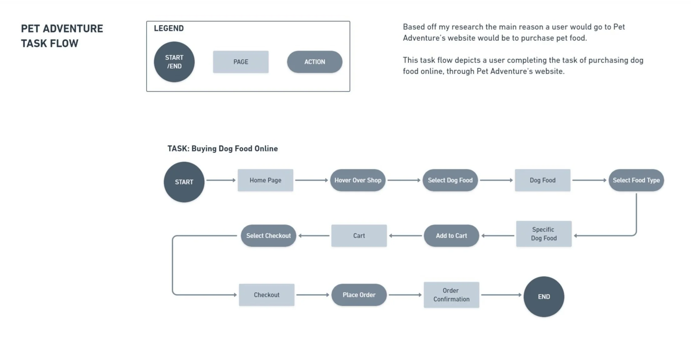
Task Flow
I used my interviews and competitor analysis to create my task flow.
Based on my research, the primary reason to visit a pet website would be to purchase pet food. So, I created a task flow of a user purchasing dog food online through Pet Adventure.
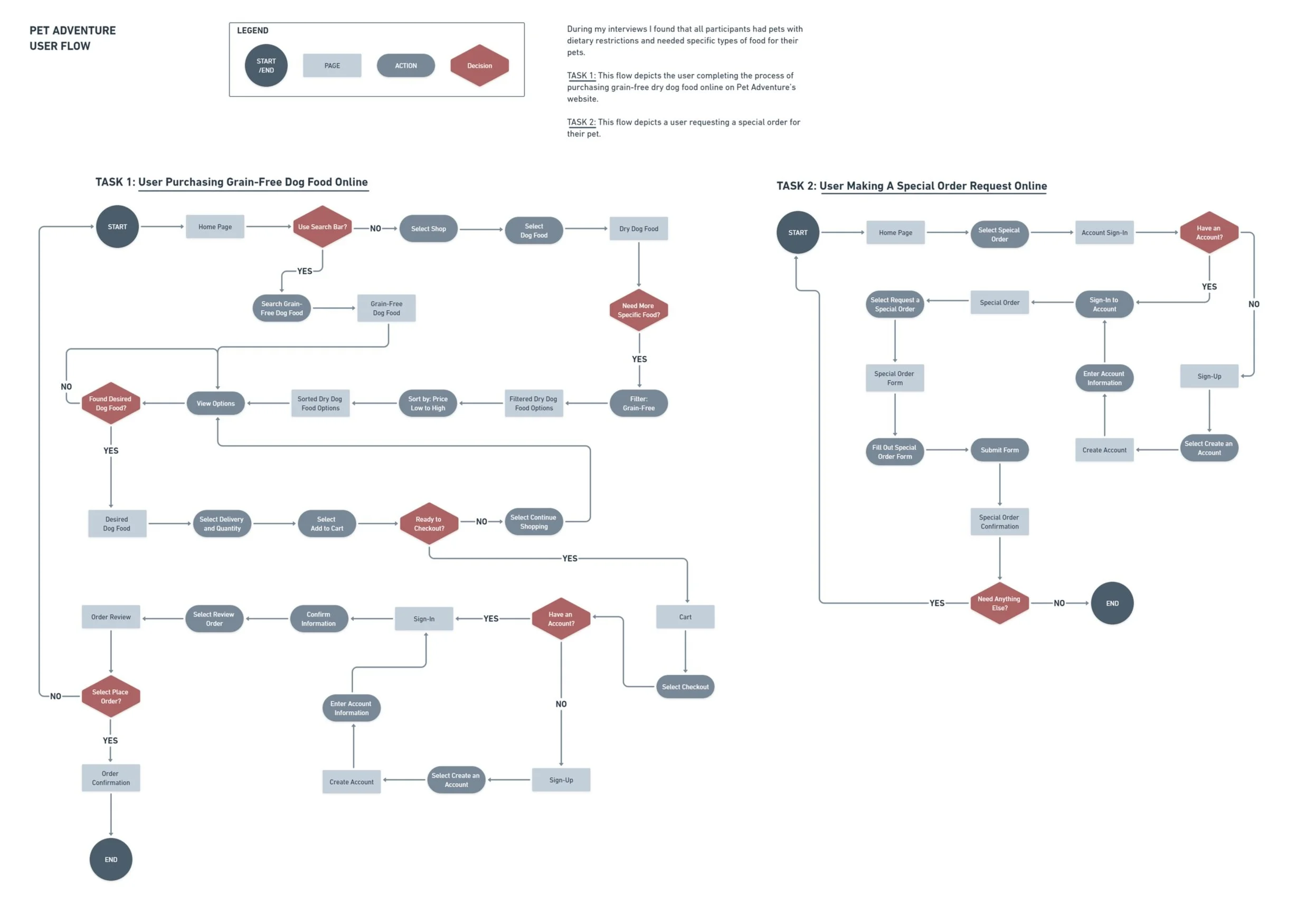
User Flow
I used my task flow and competitive analysis to create this user flow. I followed the flow of multiple competitor sites. I tried to be as specific and detailed as possible. I chose this task based on my participant interviews.
In my User Flow, I added “Complete Special Order” because it is a competitive edge against larger companies. The competitor that I used as a reference doesn't have an online special order process (they do it by phone and in-person) so I had to tweak it to fit my needs. I also went over both tasks at the end to clean them up and make them more scannable.
Lo-Fi Wireframes
I started this project by comparing competitors' sites and creating sketches. I created wireframes for the pages on my user flows and pages for features that make the company stand out.
When creating my timeline I thought this project would take less time but I had issues at the beginning with sizing and layouts. I decided against annotating these wireframes to save time but also everything is labeled accordingly so I didn’t feel annotations were necessary.
In the header, I changed the search bar to an icon because the bar was a little outdated. I also added a navigation drop-down to match competitors. On the homepage, I created different image sizes to create variety. I also had to simplify some of my pages because they were filled with too much text. To alleviate this problem with pages that needed to keep their text I created accordions.
Checkout
Order Confirmation
Frequent Buyer
Special Order
Pet Profile
Pages
Home
Dog
Dog Food
Product
Cart
-
![]()
Home Page
-
![]()
Home Page (Drop Down)
-
![]()
Search
-
![]()
Search 2
-
![]()
Product Page
-
![]()
Cart Page
-
![]()
Checkout Page
-
![]()
Confirmation Page
-
![]()
Frequent Buyer Page
-
![]()
Special Order Page
-
![]()
Pet Profile Page


Branding: Logo
I started my logo process by creating sketches. I wanted to incorporate the current company logo so it wouldn't look like a completely different store and confuse customers. I looked up the brand identities of my competitors for ideas. After generating sketches I picked one that I liked and made a few variations of it. I then used competitors again and looked at their color palettes. Most of the companies use blue and the current Pet Adventure logo is green so I kept those in mind.
My Brand Identity is Adventure, Friendly, Trustworthy, Vibrant & Family.
I wanted my colors to reflect the brand identity. So, I used orange, which represents adventure and fun & turquoise, and blue which represents trust and reliability. I wanted fun vibrant colors as well. I wanted to include green because that is the current logo color but it didn't end up working out. While looking for logo colors I decided to create my whole brand color scheme to save me time later.
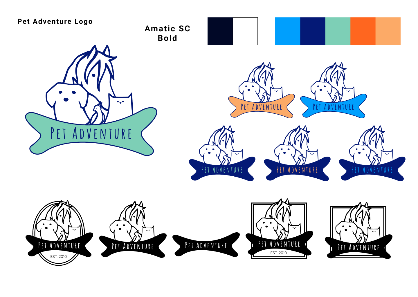
Style Tile
I decided against a mood board to save time. I also created an "image moodboard" folder in Unsplash when I was looking for style tile images.
I already had my color scheme when I created my logo. So, for fonts, I looked at competitors for reference and used a font pairing generator. I wanted a font that was thick and wide so it was easy to read.

Hi-Fi Wireframes
I used my competitor analysis, lo-fi wireframes, and style tile for reference.
I was conscientious of consistency so I tried to make sure button sizing and colors were the same throughout and I kept zooming out to see if the pages flowed together and looked like one unit.
I actually struggled at the beginning of creating my hi-fi wireframes because the colors I selected for my color scheme didn’t work with each other’s contrast. I was really set on having as much color as possible on my pages. With the lack of contrast, it was clear that wasn’t going to work so I had to change my idea. I decided to use both the blues as my primary colors, orange as my secondary color, and turquoise as an accent color.
-
![]()
Home Page
-
![]()
Dog Page
-
![]()
Dog Dry Food Page
-
![]()
Grain-Free Food Page
-
![]()
Product Page
-
![]()
Cart Page
-
![]()
Checkout Page
-
![]()
Confirmation Page
-
![]()
Frequent Buyer Page
-
![]()
Special Order Page
-
![]()
Pet Profile Page


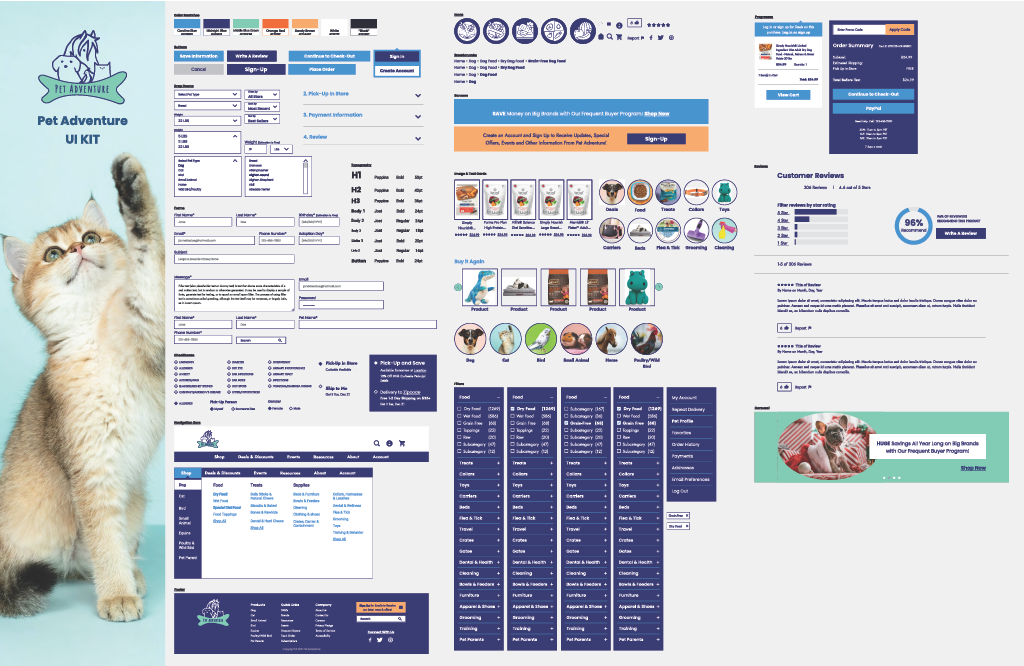
UI Kit
I like to create my UI kit after my wireframes because it’s easier to grab everything. I took all the buttons, input boxes, icons, features, etc., and copied and pasted them all into a Figma file. Then I organized them all into my UI Kit template.
There were a lot of items to copy & paste so I was very meticulous and made sure that I didn't miss anything.
— Test —
Prototyping
I took my Hi-Fi wireframe and connected all the pages together. I had to create a few more pages, drop-downs, and pop-ups to make functions work but I didn't have to create too many new things.
My main struggle was with Figma, I had trouble with drop-down menus and making sure pages scrolled but I figured it out.

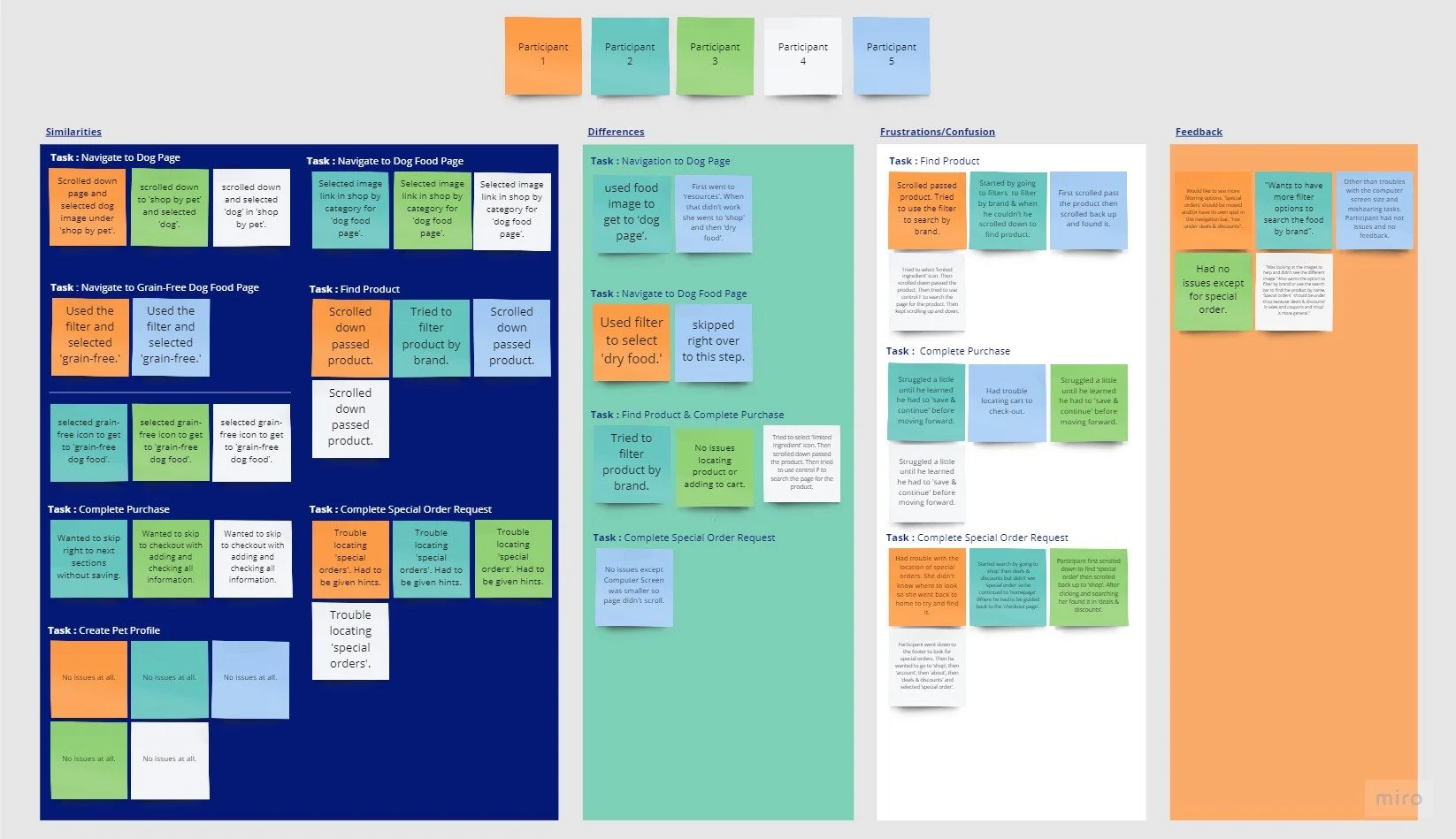
Usability Test 1
I have five participants. Each Participant currently owns a pet(s) and has shopped online for them. The test was conducted remotely and in person.
Participants were asked to perform 10 tasks divided up in 4 sections:
User Finds Grain-Free Dog Food
User Completes Purchase
User Makes Special Order
User Creates a Pet Profile
I started noticing a pattern during testing so writing down my findings was pretty easy. I made a small chart from my results to easily sift through the information and collect my findings. There were 2 major issues participants experienced. Based on the results of this test I decided to make changes to my wireframes and prototype and conduct a second usability test.
Affinity Map 1
I used my usability test results and findings to help me create this map. I already had a template so I just had to input my information.
Participants completed all the tasks asked of them.
Similarities:
5 of 5 participants completed 3 tasks with no issues.
3 of 5 participants wanted to skip saving their info in check-out and just go right to the next section.
0 of 5 participants found the need to check in to complete check out.
2 of 5 participants who didn’t use the navigation bar to go to ‘Dog Page’ used ‘Shop’ by pet and shop by category.
Frustrations/Confusion:
4 of 5 participants had issues when tasked with “finding special orders”.
3 of 5 participants had some trouble with “completing checkout”.
4 of 5 participants scrolled past the “Simply Limited dry food” one or more times.
3 of 5 participants looked for image links when navigating the site.
Recommendations:
3 of 5 participants commented that:
“Special orders” should move to ‘Shop’ or be made more visible.
The product page should have more filtering options available.
Specifically by brand.
Next Steps
Issues during testing were with filters and navigating to the ‘special order’ page. So, I needed to add more filtering options in the prototype on the product pages. I wanted to add ‘special order’ to the drop-down menu under ‘shop’ as well as ‘account’.
All users navigate differently, so it’s important to give them as many options to find what they’re looking for.
Changes:
Add more filter options on product pages.
EX: Filter by Brand
Move ‘Special Order’ from ‘Deals & Discounts’ to ‘Shop’ in the drop-down menu.
After:
More Usability Testing with new changes and new participants.
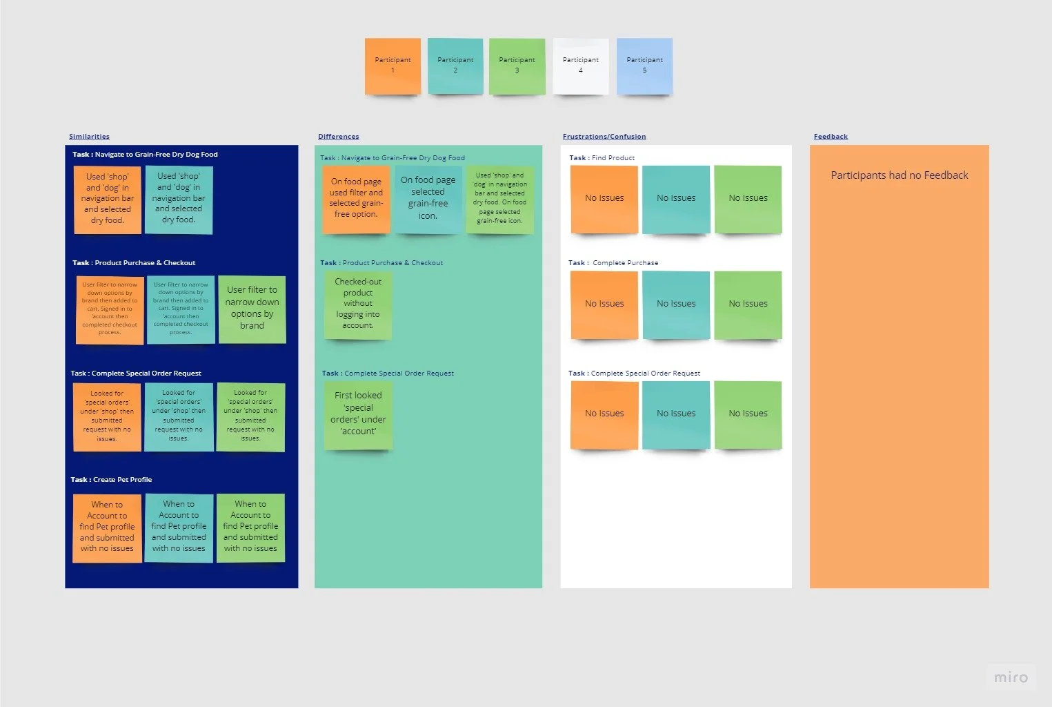
Usability Test 2
I used an updated test; after the changes made from the results in the first usability test.
I wanted to get users who had not already seen the test but because of time constrictions and schedules, I had to make due.
Participants were asked to perform (the same) 4 tasks:
User Finds Grain-Free Dog Food
User Completes Purchase
User Makes Special Order
User Creates a Pet Profile
Participants completed all tasks with no issues and navigated the site so much smoother. I was afraid that there wouldn’t be any results from this test because the participants were in test 1. However, there were still some interesting findings.
Affinity Map 2
Participants completed all the tasks asked of them.
Similarities:
2 of 3 participants navigated to the dry food page the same way; using the drop-down menu: shop->dog->dry food.
All participants completed the first usability test but this time 2 of 3 participants decided to log into ‘account’ to checkout, even though that option was available on the last test.
3 of 3 participants got to the grain-free page using different links.
2 of 3 participants filtered the product options by brand.
2 of 3 participants logged in to their ‘accounts’ to checkout.
3 of 3 participants completed the special order and pet profile tasks the same way.
Frustrations/Confusion:
Participants had no issues
Participants struggled during the first test at finding links in the navigation but when new ones were added to this test they had no issues.
— Conclusion —
All in All
I enjoyed this project. I learned a lot along the way that I didn’t from my Kaus Insurance project. One thing I learned is that your questions, depending on the product you’re researching, might need to be a little more emotional and narrative than analytical.
One of the major challenges I faced during this project was my wireframes. I had issues with Figma. There were a couple of times when Figma didn’t save my work so when I opened up the project some of my edits were gone.
Another challenge that I always have is finding images, I never know what images to use and save. And I know that it’s not necessarily an issue I would have with a company but right now it’s very frustrating.
The only thing I would change is my second usability test. I would have liked to have more usability test participants and ask more in-depth empathy test questions. I will definitely retest my usability with different participants that have never used the prototype.
My favorite aspect of this project is my branding. I am especially proud of my logo. I really wanted to keep part of the original logo in my new logo. I wanted to update the logo and have it feel more like a modern, adventurous pet store. And I feel like I really accomplish that!
Sound Like Your Cup of Tea?
If I sound like a great addition to your team, or if you just like what you’ve seen here and want to say hi, reach out!
All positive vibes are welcome!!
You May Also Like
-
![]()
DoorDash Driver
-
![]()
The Happy Hen
-
![]()
Kaus Insurance


