

— Introduction —
Background
Kaus has been in the insurance business for over 30 years. They provide all types of insurance for individuals: property, motor, liability, marine, aviation, life, health, and protection. To keep their costs low and provide easy solutions for customers, Kaus has prepared packages for specific situations, allowing for some customization. Kaus has been selling policies through regional agents instead of directly to customers, but now, they want to start selling directly to customers through an eCommerce website.
The purpose of this study is to understand what pain points users have when searching for and purchasing insurance.
Challenge
Sell insurance directly to younger customers online.
Tasks
Design a new modern logo.
Design a responsive e-commerce website
Role
Role: UX Researcher, Visual Designer, UI Designer
Team: Solo, with mentorship
— Research —
Research Goal
Find out what motivates users to purchase insurance online by:
Understanding what issues users have with their current insurance.
Determining what insurance policies are important to users.
Determining how users are currently finding insurance policies.
Research Questions
What features/functions made users choose their current insurance?
What policy packages do users currently have? Why?
Where are users finding insurance information?
How often are users changing insurance companies?
Why choose one company over another?
Why do users leave one company for another?
Competitor Analysis
Insurance is a means of protection from financial loss; primarily used to hedge against the risk of a contingent or uncertain loss. An entity, which provides insurance is known as an insurer, an insurance company, or an insurance carrier.
Services:
Auto, Home, Life, Motorcycle, Renters, Boat, Off-road vehicle, Business, Retirement & Investment, and, Banking services.
Companies:
Discounts for bundling different policies
24-7 claims reporting-->online, phone, and app
Customer Service Hours
Varied claim response times
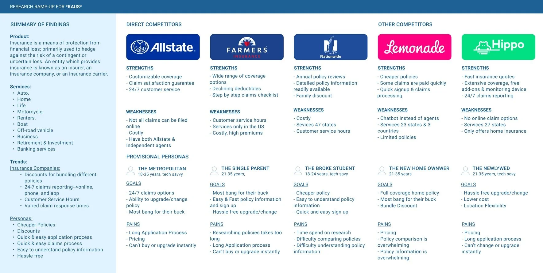
I used a template for my competitor analysis. I chose Allstate, Farmers, Nationwide, Lemonade, and Hippo as my competitors to research. I chose three major insurance companies as my direct competitors and I didn’t know what companies to put under “other competitors” so I did some research. I learned indirect competitors are companies who may offer one or more similar product options but have a more “unique” business model.
I also struggled with “strengths” and “weaknesses” at the beginning. My first iteration had too many similarities among competitors. I realized I needed to find major strengths and major differences that make each company stand out to users.
Research Participants
Five individuals participated in remote and in-person interviews. Participants were asked about risk and safety, why they picked their current insurance policies and their opinions & expectations about insurance companies?
Interview Participants:
Ages: 18-40
Employed
People who go online to find insurance
People who are looking for insurance
People who are looking to change insurance
People who have policies with a competitor.
Interview Questions
What features/functions made users choose their current insurance?
What policy packages do users currently have? Why?
Where are users finding insurance information?
How often are users changing insurance companies?
Why choose one company over another?
Why do users leave one company for another?
Research Findings
The participants all seemed to have similar thoughts and opinions about what insurance is and its purpose. When answering questions the participants would get stumped and had to think about the insurance they had and what their policies covered.
Gains
The participants all mentioned the desire for affordable insurance that lowers their out-of-pocket costs.
2 of 5 participants focused on the specific coverage that was provided when choosing their policies.
3 of 5 participants focused on price and specific coverage when choosing their policies
2 of 5 participants want higher quality service and more coverage in their policies at an affordable price.
Pains
The participants all expressed frustration with the amount of control insurance companies have over their customers.
5 of 5 participants thought insurance was good and a necessity but also expressed annoyance at the companies.
2 of 5 participants expressed frustration from their insurances having long wait periods for procedures.
4 of 5 participants mentioned affordability when discussing their insurance.
Similarities
All the participants found information for insurance online.
4 of 5 participants liked their insurance companies, 1 of 5 didn’t have an opinion.
3 of 5 participants receive insurance through their work/spouse’s work
5 of 5 participants had health insurance
Surprises
When choosing their insurance companies over competitors the participants all focused on different variables.
Affordability was talked about a lot by all participants but when asked to explain their choices quality and quantity were the most important factors.
1 of the 5 participants claimed they didn’t want to change their insurance to a cheaper option because of the hassle
3 of 5 participants’ main reasons for having insurance were for legality reasons.

Empathy Map
I created my empathy map after the first iteration of my persona because I found I had trouble etching out my persona’s details. I used an empathy map article and my empathy research interview notes to help me. I struggled a little with the insights and needs at first. It took me a while to understand that Insights were tensions, contradictions, and surprises found in what my participants said. And with my insights, I would be able to see my needs. Once this all clicked I had no further issues.

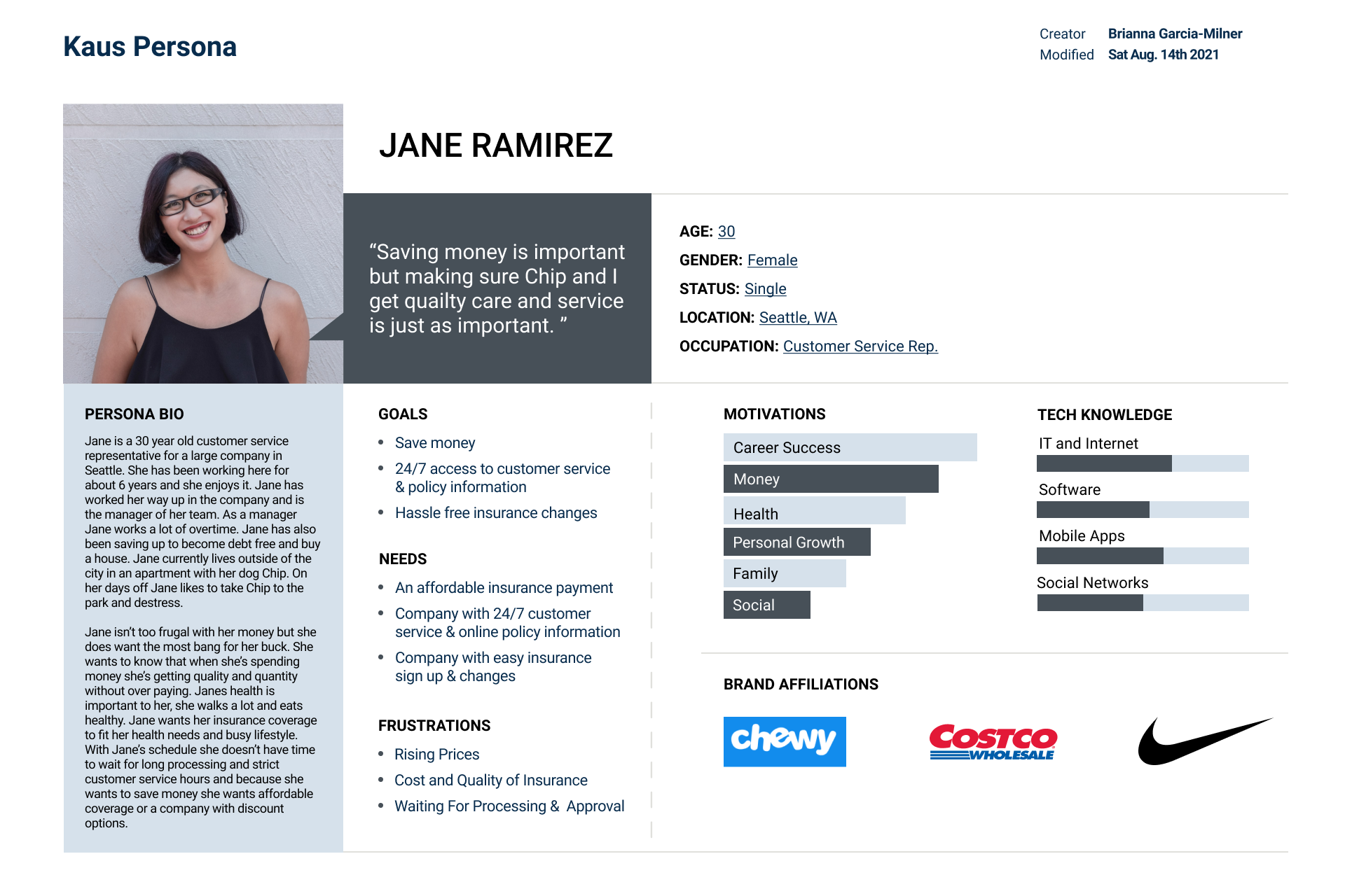
Persona
After I completed my empathy map I discovered my participant’s needs and insights and I changed my persona. From my empathy map, I created goals, needs, frustrations, and motivations for my persona.
Jane
Needs simple, hassle-free, affordable insurance.
— Define —
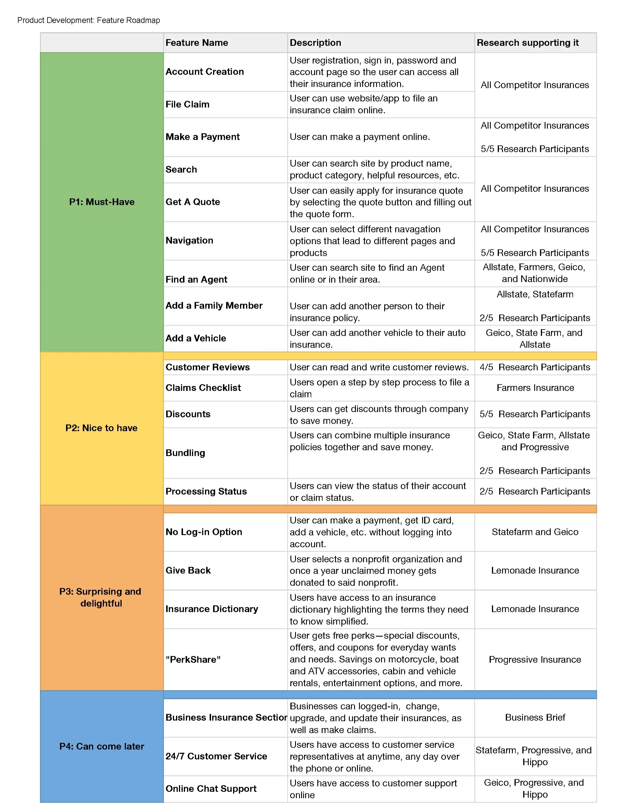
Feature Roadmap
I used information from my interviews, competitor analysis, and Kaus’ business brief to create this Feature Roadmap. I also used a feature roadmap template. I started this project by sketching a chart with the categories must-haves, nice to have, surprising and delightful, and can come later. I then added in each feature based on what my persona/participants would want and what competitors were doing. I also kept in mind features that Kaus wants to implement in the future.
Project Goals
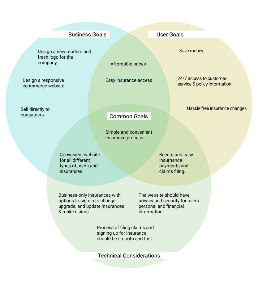
I used the information I gathered from the business brief, my research findings, my empathy map and my persona. Which I used to create Kaus’ goals, users’ goals and technical considerations. The hardest part of this project was thinking of technical considerations that didn’t include design. After filling out each section the common goal came easily.
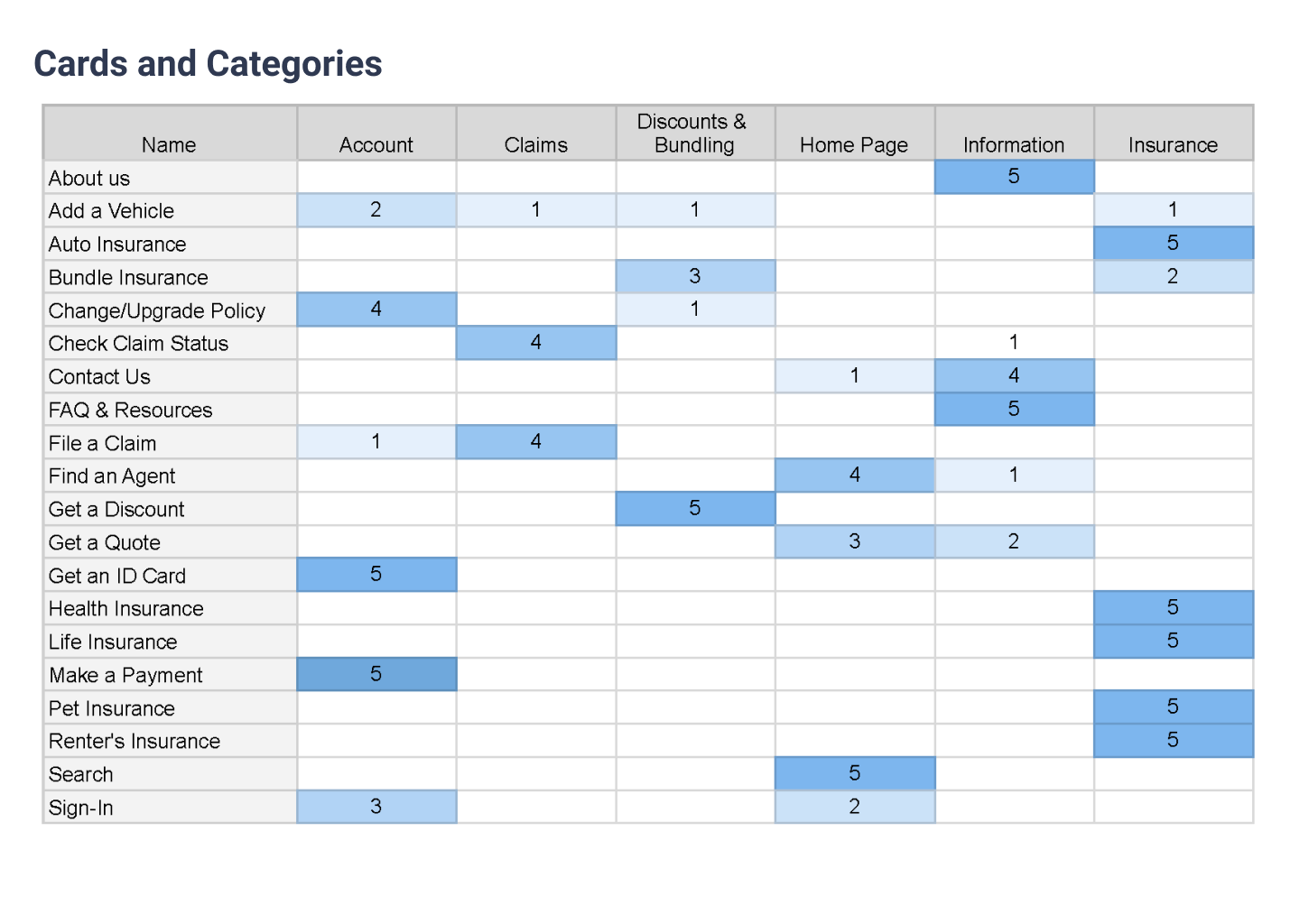
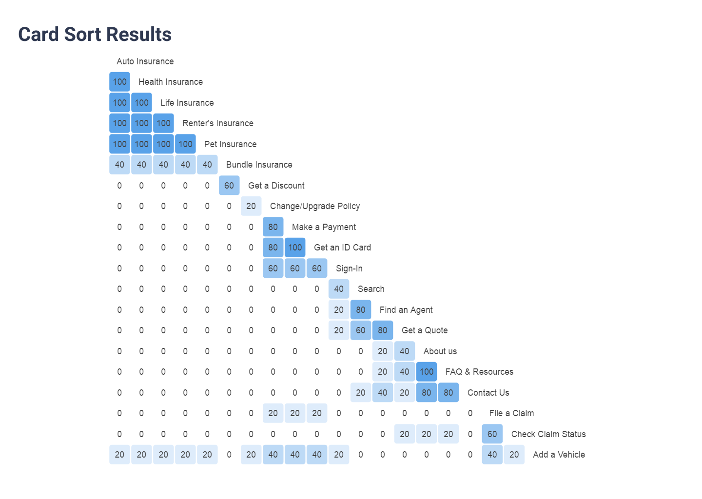
Card Sorting
I came up with 20 of my own cards using competitor websites and my project roadmap.
For the most part, the participants all grouped the information the same way. 11 out of the 20 cards were sorted into the same categories by the participants. However, some of the information was grouped into completely different categories by the participants.
For example, Add a vehicle was sorted into 4 different categories. They sorted into “Add a vehicle” into “Account”, “Insurance”, “Discounts & Bundling”, and “Claims”. This shows me that if a user were to want to add a vehicle to their insurance they might be confused about where to find it on the website.
As for “Bundle”, “Change/upgrade policy”, “Check claim status”, “Contact us”, “File a claim”, “Find an agent”, “Get a quote”, and “Sign-in” participants put these into 2 different categories. The categories that the participants picked were the same but the cards that went into each category were different. The participants differed on whether the cards went into “Homepage”, “Information”, or “Claims”. This shows me that the participants have a similar idea of where they think they might find this information but they still might search around because they’re not completely sure.
— Design —
Sketches
I started my design process with sketches to generate homepage ideas. I used various competitor sites as references. I also looked at my card sorting data and roadmap for ideas.
I annotated parts of the page that needed further information so anyone viewing the page could understand without explanation. I wanted to make sure that the most important tasks like getting a quote, were easy for users to find.
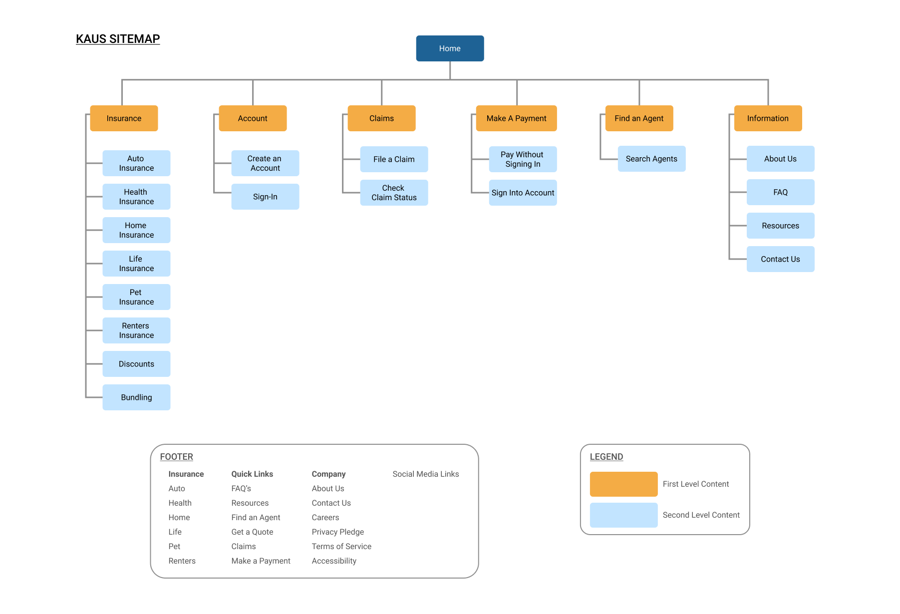
Site Map
I made a site map by using my cards and categories from my card sort and competitor websites.
I wanted to organize the content effectively so users will be able to easily navigate the site and find their desired information quickly and effectively.
I thought a lot about how people would perceive the information on the page. So, I made it so anyone reading the information would understand it with no explanation needed.
Task Flow
I used my persona and sitemap to create my task flow which depicts the tasks- “get a discount” and “get a quote”. I decided on these tasks because my research suggests that the main reasons users visit an insurance site is to browse insurance, get a quote, file a claim, and make a payment.
I started by sketching my task flow on paper so I could make changes to the information and path easily. Therefore, when it was digitized I wouldn’t have to complete extra unnecessary steps.
One of the goals is to have tasks that are simple and easy for users to perform without having to navigate to too many pages or select too many buttons.

User Flow
This user flow depicts how a user would navigate the website and complete the tasks- “browsing product discounts” and “getting a quote”. I started my user flow by visiting competitor sites and completing these tasks. As I did this I wrote down each step and then created a flow that would work best for my users goals and needs.
During my research, I found myself frustrated by having to click too many buttons or navigate to too many pages before reaching my destination. I realized how important easy and simple tasks are to users interactions with a product. Users that get frustrated on a website might give up, leave, and begin looking elsewhere.

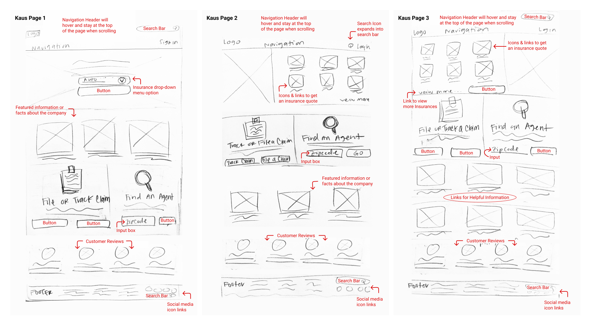
Lo-Fi Wireframes
My main goal was to make sure the actions the users are meant to perform are clearly visible.
I started by sketching out my wireframes to get a better understanding of what they will look like. I used my competitor analysis and create sketches on paper. I then created them digitally in Figma.
The first iteration of my wireframes didn’t look right. I found out it was my grid sizing, so I changed my grid from 12 instead of 8. I ended up having to also fix the sizing, alignment, and spacing on the pages until they were to my liking.
Pages
Home Page
Category
Search Results
Product

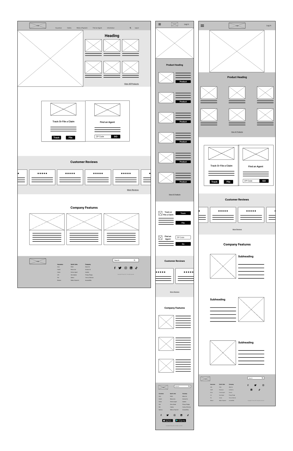
Responsive Wireframes
When creating the tablet and mobile wireframes I kept in mind that the user might be using their fingers more than a keyboard like on a desktop. With that in mind, I spaced the elements farther apart. I thought a lot about spacing the elements in a way that would not hinder a user no matter what platform they are viewing from.
I also kept in mind the idea that movement was more important than resizing. So I moved all the elements from the desktop wireframe, placed them onto each frame, and then resized them all to fit into their grids.
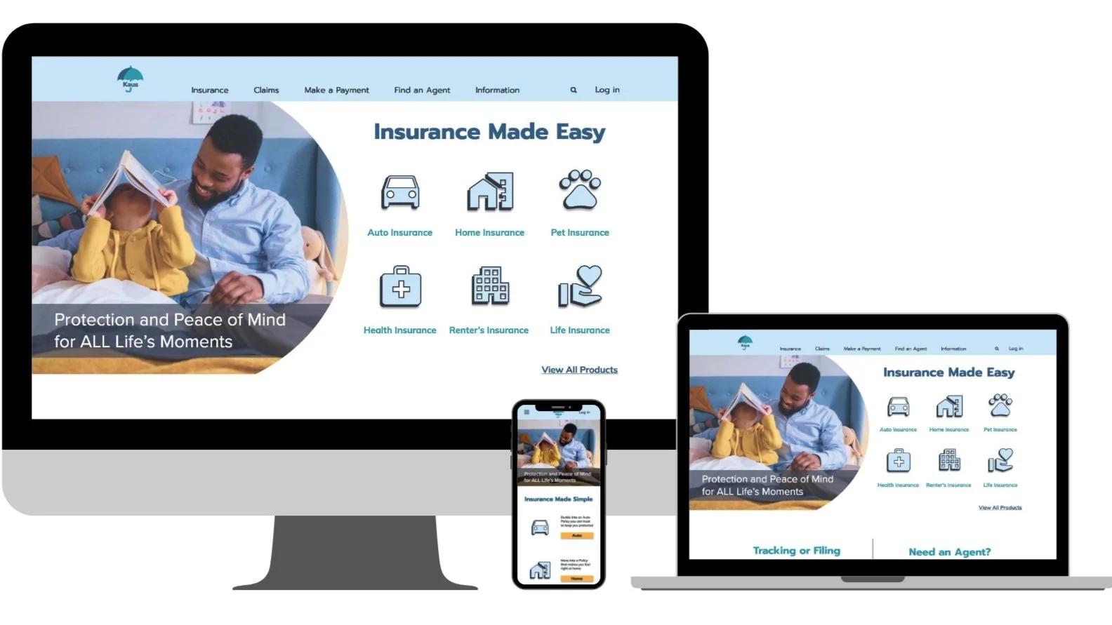
Homepage
For Desktop
For Mobile
For Tablet
-
![]()
Tablet Home Page
-
![]()
Category
-
![]()
Search Results
-
![]()
Product
-
![]()
Home Page
-
![]()
Mobile Home Screen


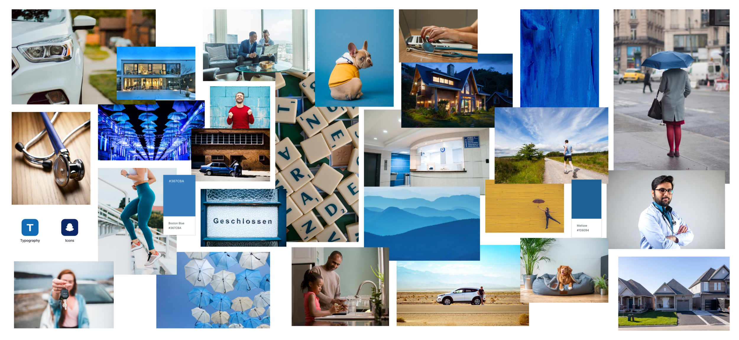
Mood Board
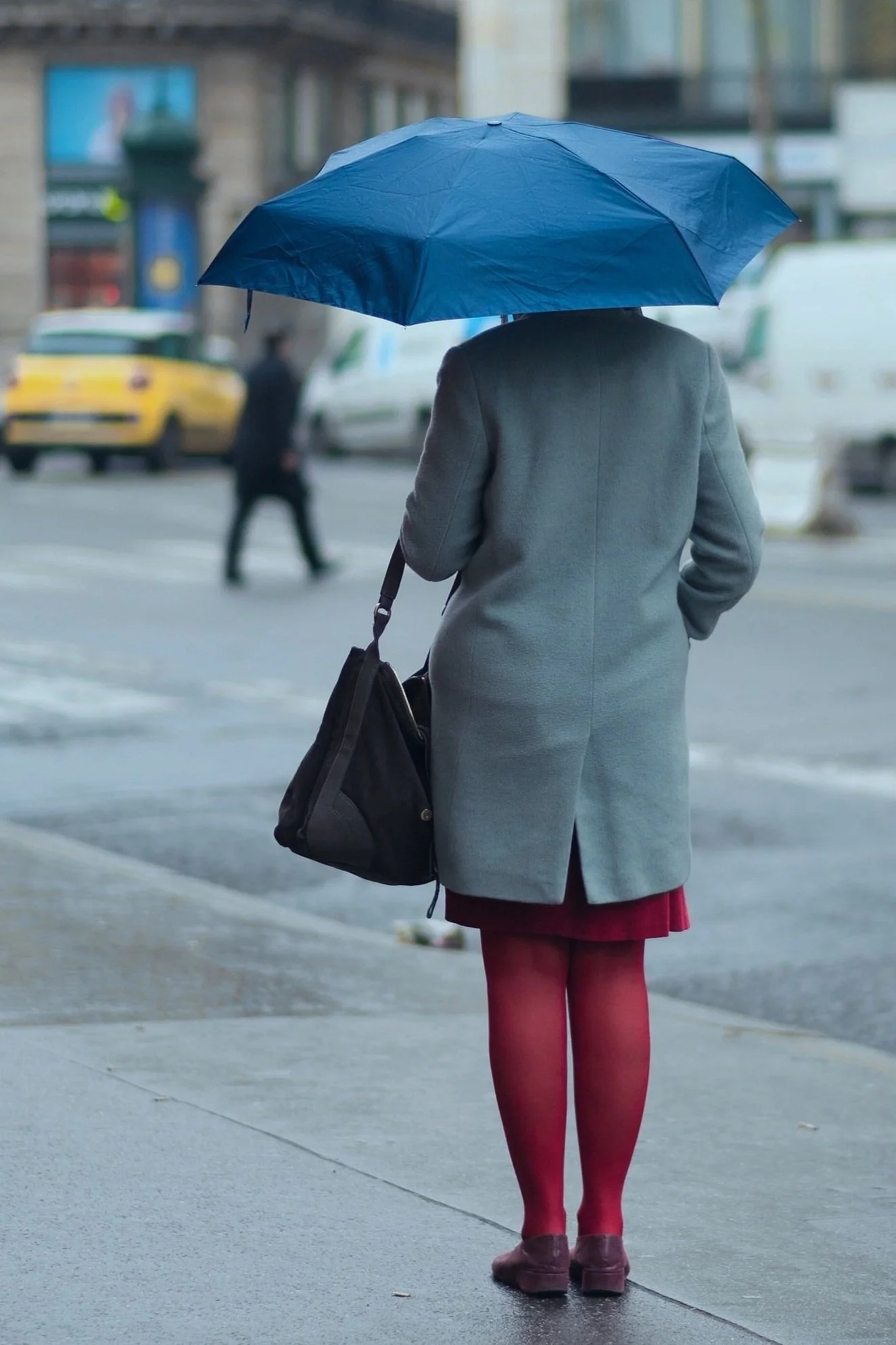
I decided on the color blue as my main color. Blue represents calming, reliability and security, which is why banks and insurance competitors use blue.
I search for inspiration on Dribbble and Milanote. I looked up representations of car, home, health, pet, life, family, and, help.
Brand Identity
Simple
Reliable
Honest
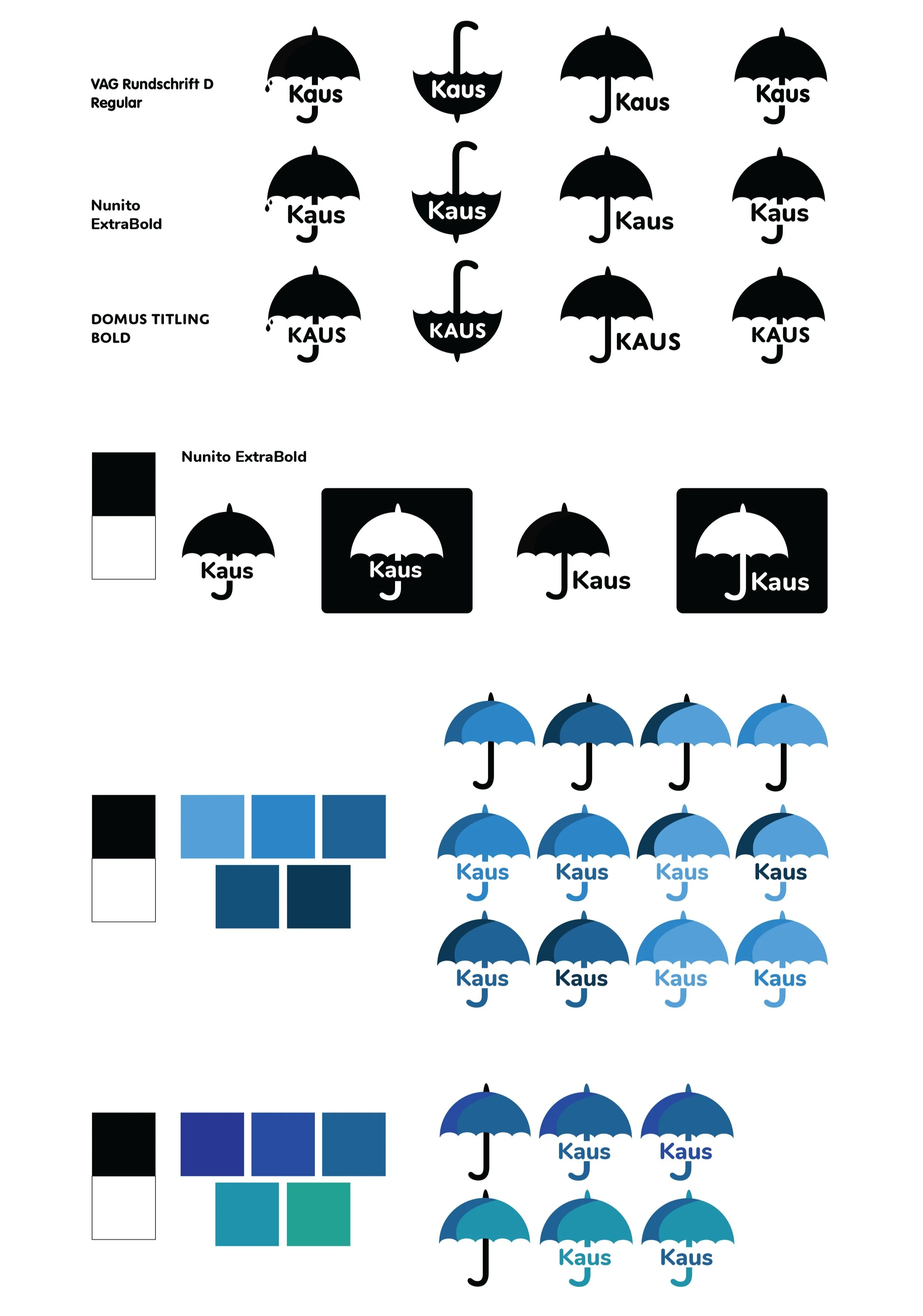
Branding: Logo
To begin my brand I needed to create a recognizable logo. I did this by looking at competitors and sketching lots of different ideas. I wanted a simple and recognizable logo. When I was creating my mood board and sketching I kept thinking of an umbrella. I wanted the logo to include an image that could be used on its own if needed.
I chose a rounded font to match the umbrella shape. The colors I chose were from my mood board and added them to a color palette generator. I chose the second set of blues as the final palette because I wanted a color palette that fit the brand values but wasn’t too serious or dark.
Style Tile
I used a style tile template and my mood board as inspiration. I used a font pairing generator for my heading and body text. I wanted fonts that were simple, with clean lines for readability. The images I used came from my mood board, I chose the ones that represented insurance and the brand values.

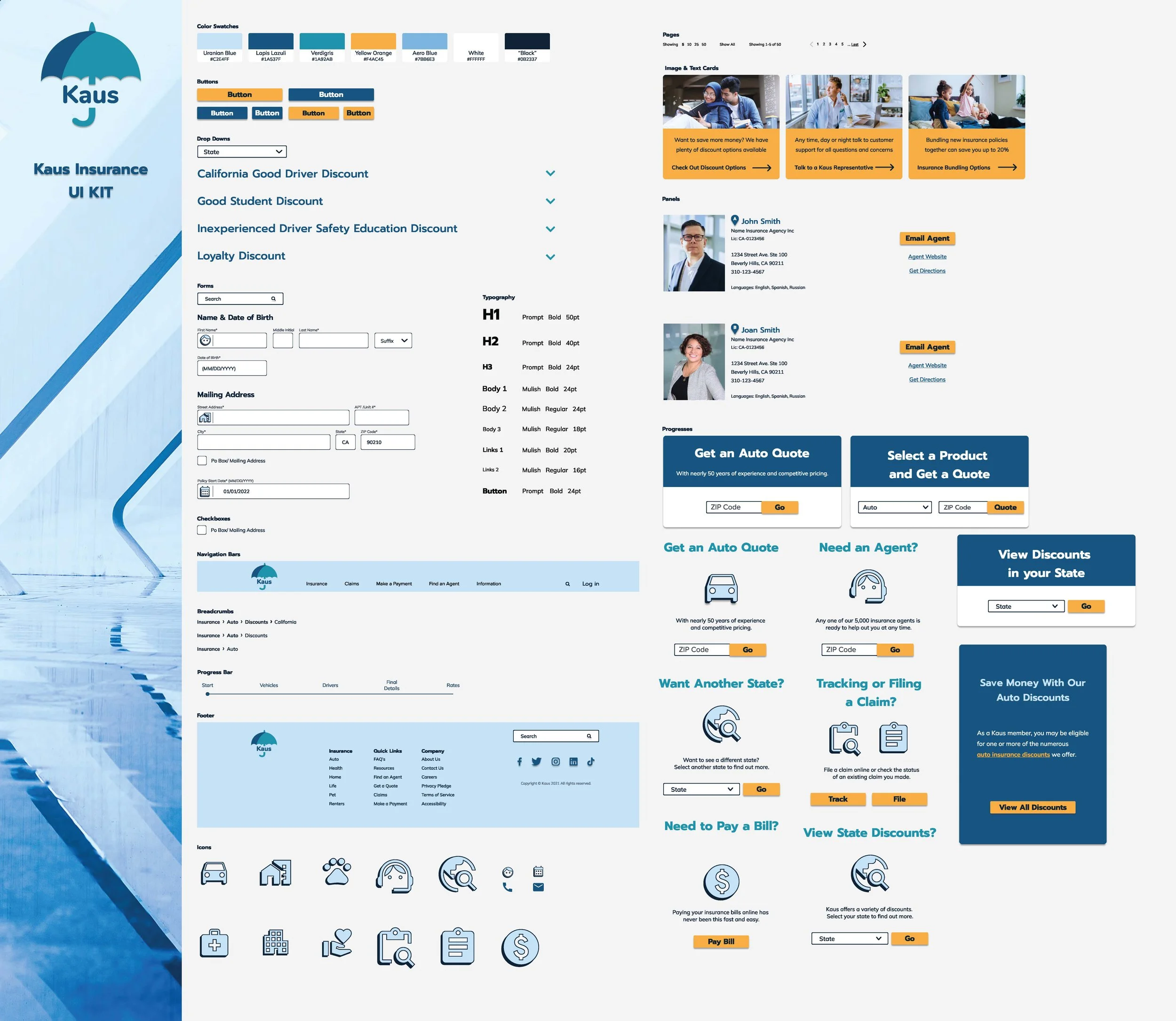
UI Kit
I created my UI kit by taking all the features that are used for the website, like buttons, input boxes, navigation, footer, etc., and putting them together on one page.
The UI Kit was easy for me because I created my high-fidelity wireframes first so I ended up just copying all my elements and pasting them together. Having all the elements together on one page also helped me to check the visual cohesion across my site.
Hi-Fi Wireframes
I used my user flow as a reference for what pages to create. I also used my style tile and mood board for my colors, fonts, images & icons.
I sketched out all of my pages before digitizing them. I took a lot of references from competitor sites. I had issues with my colors. In my first iteration, I used way too many different colors so the visuals were overwhelming. I also couldn't quite figure out the colors for my icons. But once I selected my primary, secondary, and accent colors, I no longer had issues.
I ended up creating 4 more pages to be used for my prototype and usability testing.
Pages
Homepage Mobile
Homepage Desktop
Auto Page
Auto Discounts
California Discounts
Agent Page
Agent Website
Quote
-
![]()
Auto Page
-
![]()
Auto Discounts Page
-
![]()
State Auto Discount Page
-
![]()
Agent Page
-
![]()
Agent Website
-
![]()
Auto Quote Page
-
![]()
Homepage Mobile
-
![]()
Homepage Desktop


— Test —
Prototyping
I connected all the links and pages together and tested them multiple times to make sure everything connected properly and aligned.
My dropdown overlays aren't quite right but they do their job. I also had trouble with scrolling, I can't seem to get the page to scroll down lower to view everything, on certain overlays.
The prototype was tedious because of all the elements but despite any struggle, I still really enjoyed the process.

Usability Test
I have five participants. A majority of the participants are young, ages 26-31. I chose to include an older participant to perform as the outlier. I wanted to know how someone not particularly familiar with computers would navigate the pages. The test was conducted remotely and in person.
Usability Tasks
Participants were asked to perform 7 tasks.
Get to the Auto Page
Find Discounts
Get to California Auto Discounts
Find an Insurance Agent
Contact Insurance Agent
Go back to Homepage
Get an Auto Quote
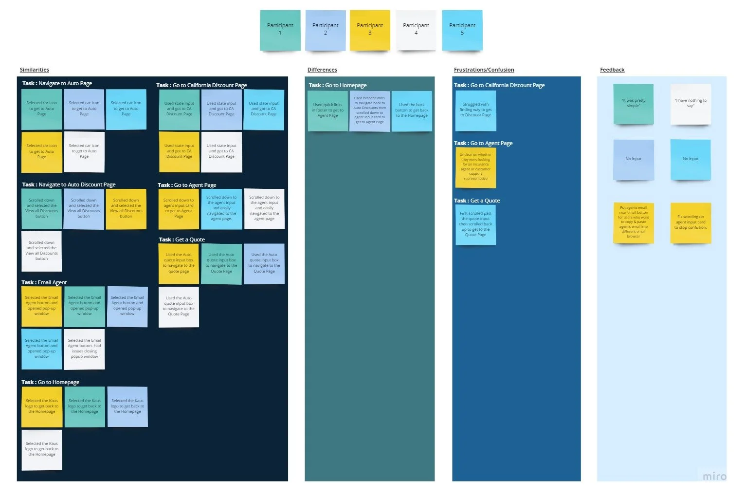
Affinity Map
I used my test notes. I wrote every participant's actions on "post-its" and divided the information by participants, categories, and tasks.
Participants completed all the tasks asked of them.
Similarities:
5 of 5 participants were able to complete all the tasks
5 of 5 participants completed Task 1 and Task 3 with no issues.
2 of 5 participants instinctively wanted to use the back button to go to the homepage
Frustration/Confusion:
1 of 5 participants had trouble with 5 out of the 7 tasks.
3 of 5 participants had issues when tasked with “finding an agent”.
3 of 5 participants scrolled past the agent card once or twice.
Recommendations:
4 of 5 participants at the end had no input to add.
One participant suggested additional information in certain sections:
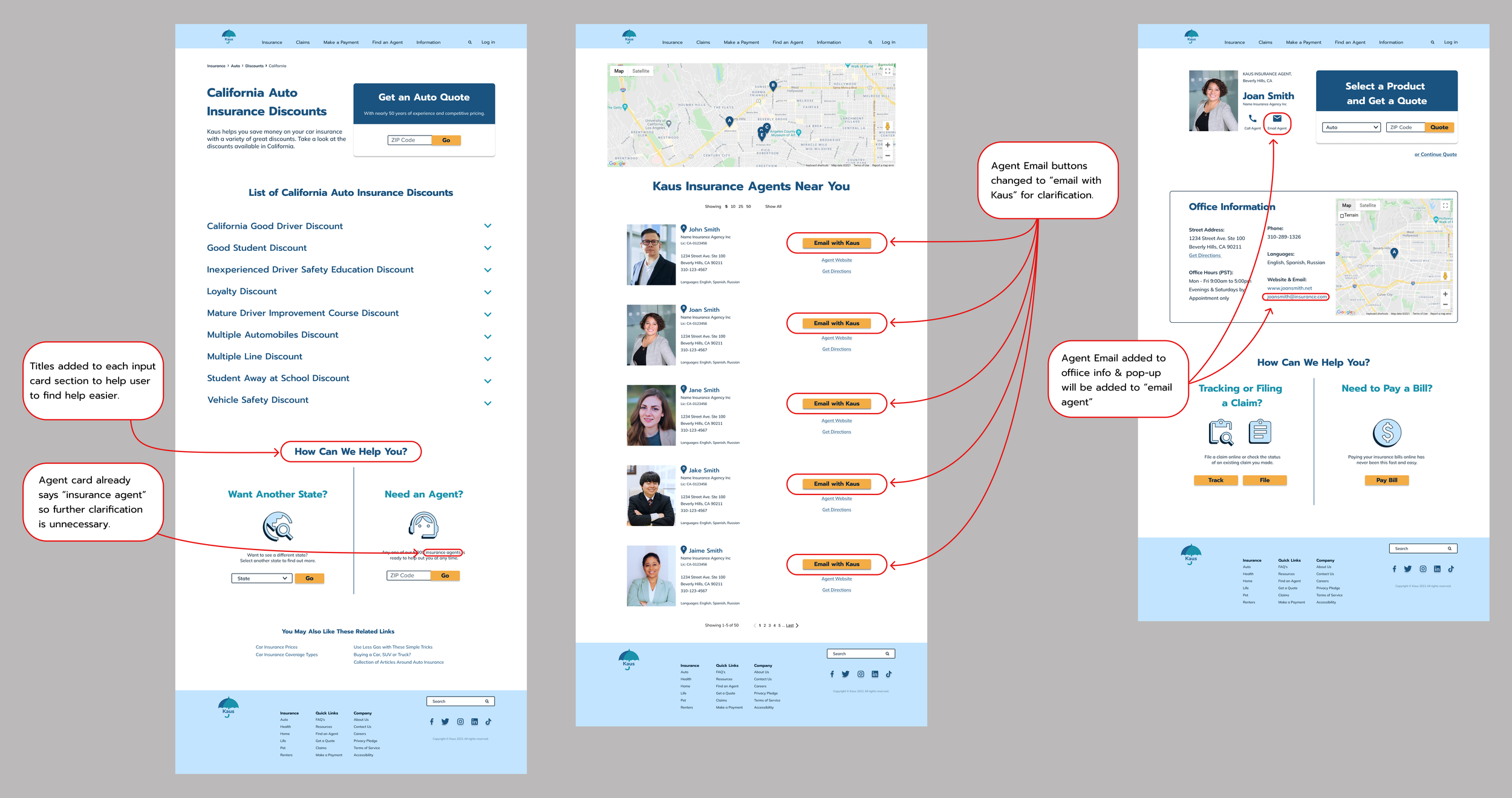
Agent Email available on the agent page
Agent Card confusing and needs revision
— Conclusion —
Next Steps
Step 1:
Create additional features and or pages to be added to the prototype to increase participant options.
Step 2:
More Usability Testing with new changes and new participants.
After my testing, I completed some suggestions to see if they would work or not.
I added section headings for users to locate information easier. I also changed the button text and added a pop-up option.
From this test, I learned that some participant suggestions can be helpful and some not so much. Participants might offer input because they think they need to not because they should. It is ultimately up to the designer what suggestions to listen to.
All in All
Being that this was my first case study, I learned a lot throughout the process. One major thing I learned is that research and interviews are the foundation of the system. Without them, there would be no structure or information to gather ideas. I constantly referred back to my users and persona to double-check that my designs aligned with their goals and needs.
Another big thing I learned from this project is that sometimes as a designer, you need to know when to change plans or walk away from an idea altogether. Some ideas just don’t work and there’s nothing wrong with that.
My favorite parts were user research and branding. User research unexpectedly piqued my interest. I have always enjoyed learning about the human mind and the way people think. Of course, as an illustrator, I also love playing with colors and creating images so it’s no surprise I enjoyed branding, even though I had some issues. I will always love gaining new skills and experiences.
Sound Like Your Cup of Tea?
If I sound like a great addition to your team, or if you just like what you’ve seen here and want to say hi, reach out!
All positive vibes are welcome!!
You May Also Like
-
![]()
Pet Adventure
-
![]()
DoorDash Driver
-
![]()
The Happy Hen


