


— Introduction —
Background
With the revival of weddings and the potential for multiple ceremonies and receptions, it’s important for couples to make sure everything runs smoothly. Having the ability to communicate ideas, photos, and messages all in one place will relieve some of the stress of the already chaotic planning process.
The purpose of this study is to understand the main pain points couples have when planning events and sharing ideas with the wedding party and their guests.
Challenge/ Task
Design an MVP (Minimum viable product) for an app.
Role
Role: UX Researcher, Visual Designer, UI Designer
Team: Solo, with mentorship
— Research —
Research Goals
Understand how a user currently organizes and communicates their wedding event planning.
Determine how a user currently collects images and videos from weddings and/or other related events (ie. bachelorette party).
Determine what pain points users currently have.
Research Questions
What is the communication and planning process for users' wedding-related events?
What do users currently use for wedding-related event planning and communicating?
How do users communicate & plan their wedding-related events now?
How do users currently collect images from weddings & related events?
What frustrations do users experience?
How do user frustrations affect their planning?
How do users deal with their frustrations?
Competitor Analysis
Wedding Planning/Communication App.
Companies:
Messaging
Organization & Planning
Task Management
Itinerary/Calendar
Calculator & Budgeting
Photo & video sharing
For my competitors, I summarized one main feature that helps or hurts them. Competitor’s biggest weakness, biggest strength, or biggest difference. I looked at competitors and their reviews to find what they offer and what users liked and disliked. I chose each competitor’s features based on their relation to my research goals and what I wanted to include in my app.

Research Participants
I used my research plan questions and research goals to create my interview questions. I created questions that were not only for couples planning a wedding but anyone planning any event/s related to a wedding (rehearsal dinner, bachelorette party, etc.).
I tried to focus more on the process of planning and organizing with and without the use of apps. On the off chance, the user doesn't use an app, and to get an idea of the user's needs and pain points regardless of app usage.
Interview Participants:
21+ years
Currently planning a wedding
Currently planning a wedding-related event
Recently Married
Married in the last 8 years
Interview Questions
What is your current planning process? What do you use to help you during planning?
How do you interact with the wedding couple, wedding party, and/or guests during the planning process?
Can you describe a time when you had an issue or issues with planning and/or communicating? What happened?
Research Findings
I wrote down all of my notes on paper during my interviews and then typed them all onto a Google document afterward.
I was supposed to have more participants but they never responded. Luckily, the 4 participant results I got, were enough to complete my empathy map.
Participants
One Married
One Married and currently planning a wedding
Two engaged and currently planning a wedding

Empathy Map
I had to write down notes to help me get what the users were thinking and feeling from their words and actions. Writing it down on paper helped me break it down better than seeing it on the screen.
Needs
Users need a way to organize tasks and duties.
Users need a way to stay on schedule.
Users need a way to communicate with the necessary people.
Users need to keep track of budget.
Users need a way to gather images.

Persona
I used the needs and insights from my empathy map to create my persona. I started by adding my quote and needs and created everything else around those.
Zoey Jacobs
Needs a way to organize tasks & duties and stay on schedule, communicate with necessary people, and keep track of the budget.

— Define —
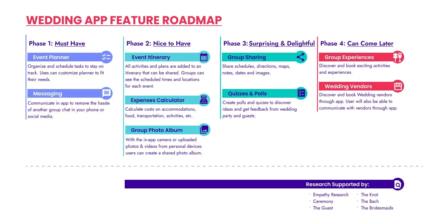
Feature Roadmap
I used my empathy map & persona to create my features. I also used my competitors for reference. Since there are many features my main focus will be the Event Planning and Messaging aspects of the app.
In the "can come later" section, I added an Experience Discovery and Vendors Feature because I feel like my participants touched on these subjects slightly in my interviews, so they are not the main issues or goals but I felt like they fit.
— Design —
Site Map
I downloaded my competitor apps to use as a reference for my site map. During my research I found another competitor to use. I had to sketch out the competitor's site maps on paper because they were all different and I wanted to compare them together.

Task Flow
I made my task flow a little different this time. I created 3 flows but one flow consists of 2 flows because they relate to each other and it saved space. I ended up adding the image flow because I wanted to test it as one of my main features.

User Flow
This flow has a lot of decisions. I had to sketch the flow on paper to follow the path clearly because of all the decisions. While creating my flow I ended up connecting many tasks together, which resulted in creating multiple end-points and “ending” options for users.
I started this flow not realizing I had made an assumption that “users would only be using the app to complete one action at a time”. Once I realized this, I quickly corrected the flow to reflect the many paths the user would take to complete the outlined actions.
I also decided against the camera flow that I included in my task flow because it wasn’t a main concern with participants and it would create more work for me.

Low-Fidelity Wireframes
I started my wireframes with sketches. I used my competitors and my user flow. I also created different screen variations for certain screens that I think I might use for my prototype.
I followed my user flow and added screens for several scenarios, such as user canceling the event, user messaging one individual instead of a group, etc.
I originally had multiple calendar options but decided to have only one. I did this so users that don’t want to add their events to their mobile calendar can still use the calendar in the app. The calendar option in the app will display the user’s events by month with the option to filter by year.
Engagement Party
Event Edit
Guest Contacts
Guest Messages
Create Message
Screens
Home
Tasks
Itinerary
Events
Event Template
Create Event
-
![]()
Tasks
-
![]()
Itinerary
-
![]()
Events
-
![]()
Event Template
-
![]()
Create Event
-
![]()
Engagement Party
-
![]()
Edit Event
-
![]()
Guest Contacts
-
![]()
Messages
-
![]()
New Message
-
![]()
Home


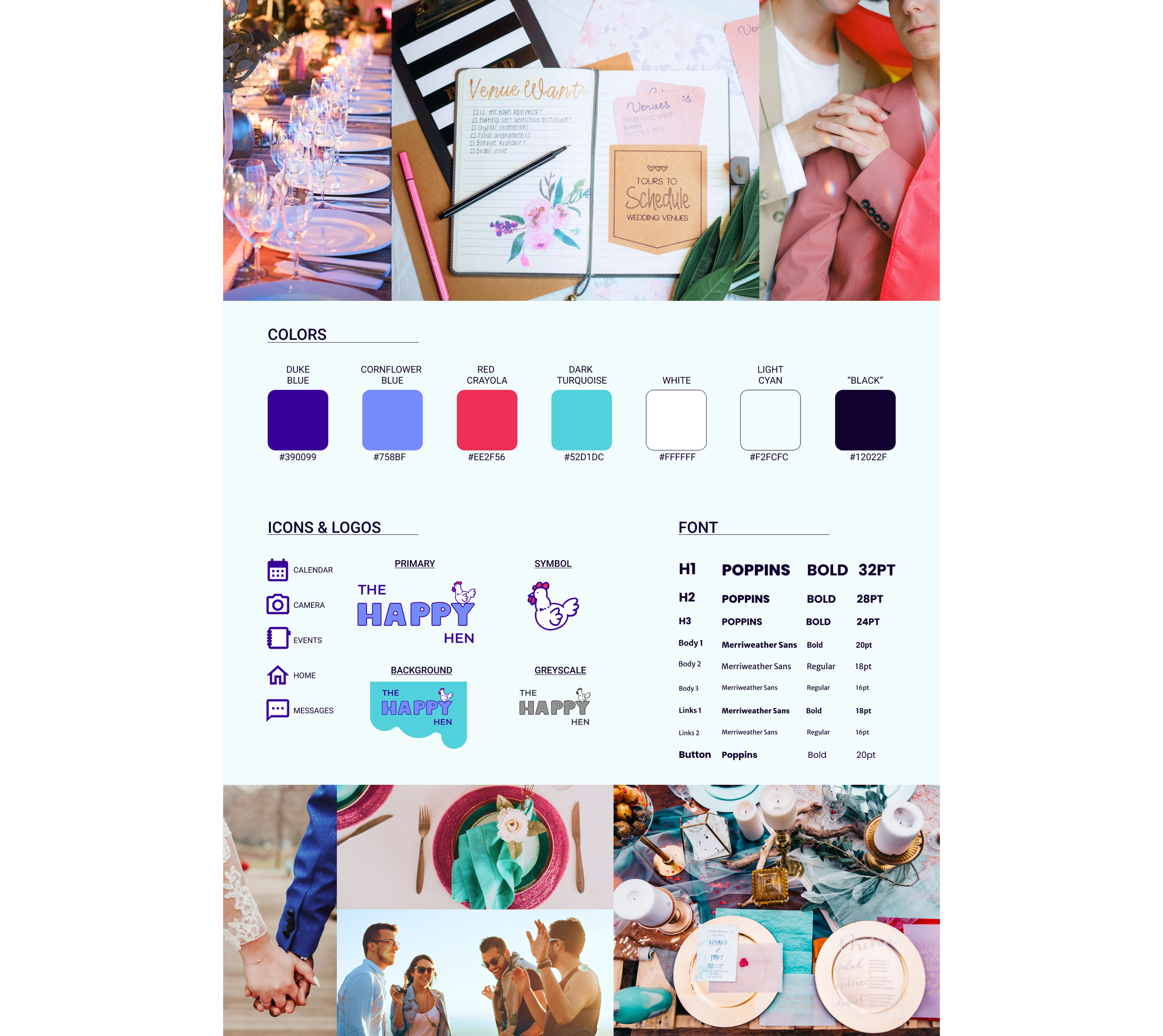
Branding: Logo
I started my logo by coming up with name ideas. I looked up wedding-related words to create a pun or something fun but I didn't have much luck. I also wanted a fun little mascot from the logo. I ended up choosing a hen because in the UK they refer to a "bachelorette party" as a Hen-Do or Hen Party. After I got a name I started sketching logo ideas. Once I had my sketches I recreated them in Figma & added color. I wanted bright, fun colors that popped.

Mood Board
I looked for images containing the colors from my color scheme. Images with excitement and movement and pops of color.
My brand identity is:
Festive
Joyful
Funky

Style Tile
I used images from my mood board and my style tile template to create this.
For Text, I wanted fonts that were round, clean, and big enough to still be readable when small, so I chose Poppins & Merriweather Sans.
High-Fidelity Wireframes
I got stuck with too many references and didn't know where to start. But I settled on the idea of a lava lamp. Pages with no background bubbles, like “Events” & “Events Template” screens, will have turquoise bubbles appear when the user selects an event.
I really wanted to create some dimensions on the screens because they felt a little flat to me. So I added some drop shadow effects and layering to titles and images.
I also decided to really go with the chicken theme and used chickens for profile icons. The Task screen isn’t as polished as the others because I don't think I will use it in my prototype but wanted to include it just in case.
Create Event
Engagement Party
Event Edit
Guest Contacts
Guest Messages
Create Message
Screens
Login
Home
Tasks
Itinerary
Events
Event Template
-
![]()
Tasks
-
![]()
Itinerary
-
![]()
Events
-
![]()
Event Template
-
![]()
Create Event
-
![]()
Engagement Party
-
![]()
Edit Event
-
![]()
Guest Contacts
-
![]()
Messages
-
![]()
New Message
-
![]()
Login
-
![]()
Home


UI Kit
I created my UI kit after my wireframes, in case I need to change anything. I took all the buttons, input boxes, icons, features, etc., and copied and pasted them all into a Figma file. Then I organized them all into my UI Kit template.

— Test —
Prototyping
I had to create a few more pages, drop-downs, and pop-ups to make functions work. I had a lot of little elements to connect and it was tedious but I learned how to create a sticky layer and I'm really happy with the results.

Usability Test
I had an idea of what I wanted to test users on when creating my hi-fi wireframes. I'm testing users on the events & messaging aspect of the app since they are my main focus. However, I started second-guessing if I should include tasks or not in the testing.
The test is pretty simple. I'm mainly just trying to see if users can find & create events since it's not blatantly obvious.
This time, I included the option for users to explore the app before starting tasks. I wanted to find out if they perform better.
Usability Tasks
Participants were asked to perform 4 tasks.
Task 1: Create an Event
Task 2: Edit an Event
Task 3: Find Messages
Task 4: Create a Message
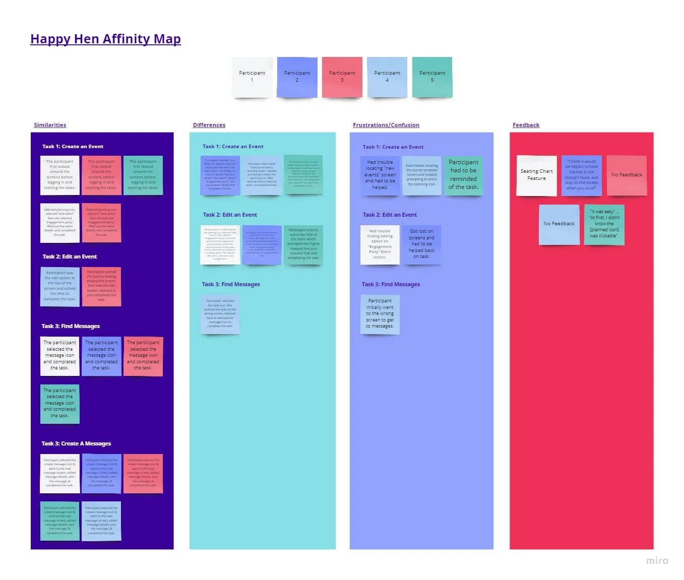
Affinity Map
To create my map I took my usability test findings and categorized them into similarities, differences, frustrations/confusion, and feedback.
Similarities:
3 of 5 participants looked around and got familiar with the app before starting the tasks.
2 of 5 participants instantly selected the planner icon to create an event.
4 of 5 participants completed Task 3 with no issues.
5 of 5 participants completed Task 4 with no issues.
Differences:
3 of 5 participants looked around for the “Create an Event” screen in different locations.
1 of 5 participants looked for “Messages” in the wrong location.
Frustrations/Confusions:
3 of 5 participants needed prompting or a reminder of task 2.
2 of 5 participants got lost and confused when trying to edit the event time.
3 of 5 participants missed the edit option at the top of the “Engagement Party” event screen.
2 of 5 participants commented that they didn’t realize the planner icon was clickable.
Feedback:
2 of 5 participants gave no feedback
1 of 5 participants commented, ”I think it would be helpful to have the bar at the bottom hover and stay on the screen when you scroll”.
1 of 5 participants suggested a seating chart feature in the future.
Next Steps
After testing, I found that there were no major changes that needed to be made to the prototype. I did end up changing the navigation bar to hover on the screen when scrolling. However, based on the issues the participants did have, there are some changes I need to make for future projects. Such as making sure the users know the planning icon is clickable.
— Conclusion —
All in All
I had a pretty good idea of what prompt I would choose for this project before I started. I am in the wedding party of one of my closest friends. As she is planning her wedding she had us download a bachelorette party app to communicate and share ideas. From the beginning, there were issues with the app. The idea was really good but the execution wasn’t and that was what led me to the idea for this project.
The beginning of this project was the easiest for me. I struggled somewhat with finding relatable competitors but once I did, I was golden. When I started my empathy research I began to have issues. I lined up several participants that ended up falling through. It was frustrating but luckily for me, I was able to get enough information from the 4 participants I had.
One of my favorite aspects of this project, like my other projects, is my logo. I really enjoyed the process of thinking and sketching out all the ideas that came to mind. It came to a point where I liked so many of my designs that I struggled to pick just one.
Another aspect I really enjoyed but struggled with the most was my high-fidelity wireframes. My first iteration was not to my liking but I couldn’t figure out why. I went back to my mood board and logo designs and remembered what identity and feelings I was trying to provoke. Going back helped me realize that I didn’t like my wireframes because they didn’t fit the brand values and vibe.
Going back and re-evaluating my brand helped me realize how important it is to constantly double-check my work when something feels off. And to go back and make sure that the brand identity is cohesive throughout the project.
Sound Like Your Cup of Tea?
If I sound like a great addition to your team, or if you just like what you’ve seen here and want to say hi, reach out!
All positive vibes are welcome!!
You May Also Like
-
![]()
Kaus Insurance
-
![]()
Pet Adventure
-
![]()
DoorDash Driver


